What is a Logo? A logo is a visual mark that identifies a business or…
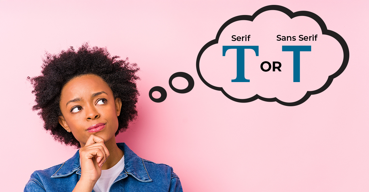
To Serif or Sans Serif, That Is The Question
Understanding The Basics
Have you heard of serif and sans serif fonts before, but not sure what the difference is? If so, no worries, let’s dive on in!
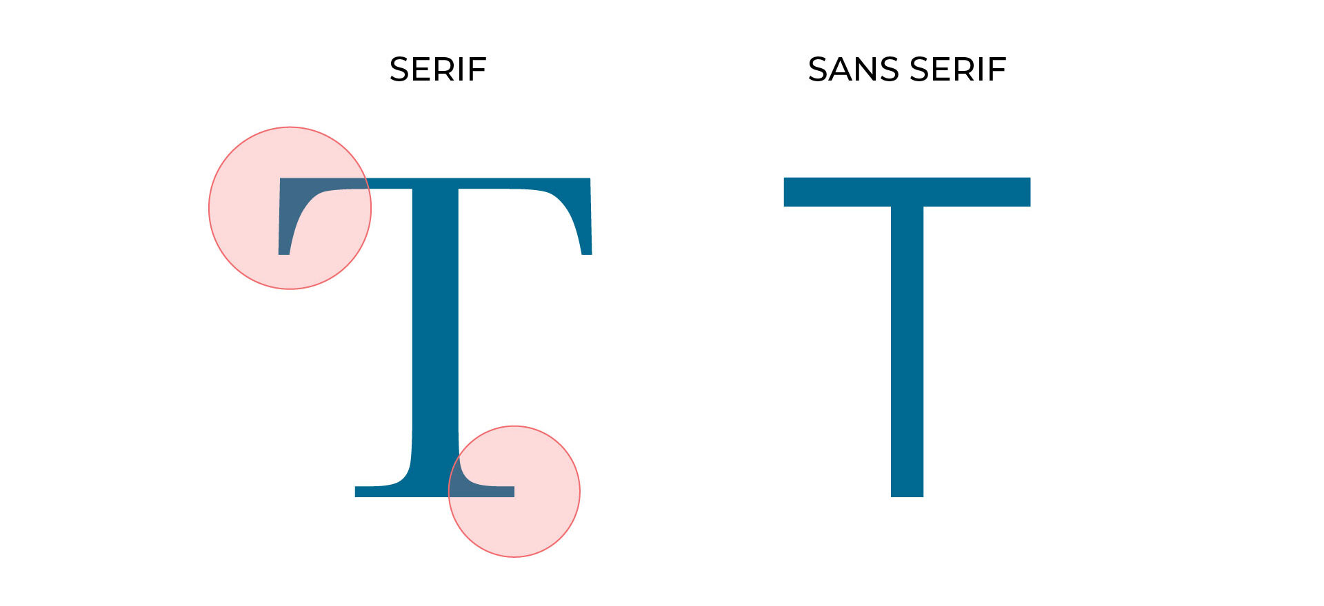
A serif font is a typeface that has small decorative strokes or flourishes that stem from a larger stroke on a letter. These small strokes and flourishes often provide a more traditional or formal feeling to the font, as well as, at times, a more elegant feel.
In contrast, sans serif fonts, which includes the French term “sans” in the name, means “without,” are typefaces that don’t have the decorative strokes or flourishes on their letterforms. These fonts tend to be more minimalist and modern.
Below is an example of each style to visually define the differences between the two.
Serif Fonts
Ever notice how wedding invitations often use serif fonts to display the event information or how books and newspapers primarily utilize serif fonts? As mentioned earlier, serif typefaces provide a sense of traditionalism and formality. Serif typefaces are like the “black tie” of fonts. They’re confident, knowledgeable, trustworthy, professional and stylish.
Many printed items with longer copy tend to use a serif typeface because of their perceived readability from how one’s eye is guided from letter to the next due to the serifs. Serif typefaces also make great headlines on posters and other items where they can be typeset large, allowing the serif flare to really make an impact.
To take it another step further, within the serif category there are also different classifications of serif typefaces based on their style and how they’ve changed and developed throughout history. These classifications include old style, transitional, modern, and slab serif. Each of these classifications have unique features to their letterforms. For example, slab serifs use thick, block-like serifs compared to the transitional serif typefaces where the serifs taper to a thinner and sharper serif. Review the chart below to see examples of serif typefaces and classifications. 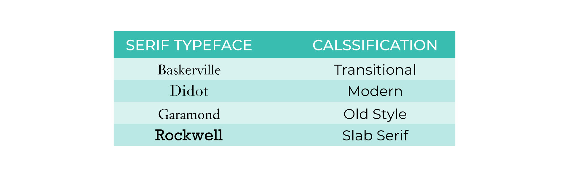
Sans Serif Fonts
If serifs are the “black tie”of typefaces, then consider sans serifs to be the “business casual” attire equivalent. Even without serifs, these typefaces can still provide a professional and traditional feel but they tend to be more modern, minimalist and friendly in their aesthetic. While sans serif typefaces work well in both print and digital formats many argue that they are easier to read on a screen compared to serif style counterparts.
Sans serif typefaces are also a good choice for headlines due to their minimalist and clean appearance even when set in bold style. They are even widely used on road signs due to this clean appearance, making them easier to read quickly while driving.
Just like serif typefaces, sans serifs also have classifications. These include, grotesque, neo-grotesque, humanist, geometric, and display/decorative sans. An example of some of the unique features are the handwriting feel of the humanist classification compared to the more uniformed line thickness of neo-grotesque. Review the chart below to see examples of sans serif typefaces and classifications. 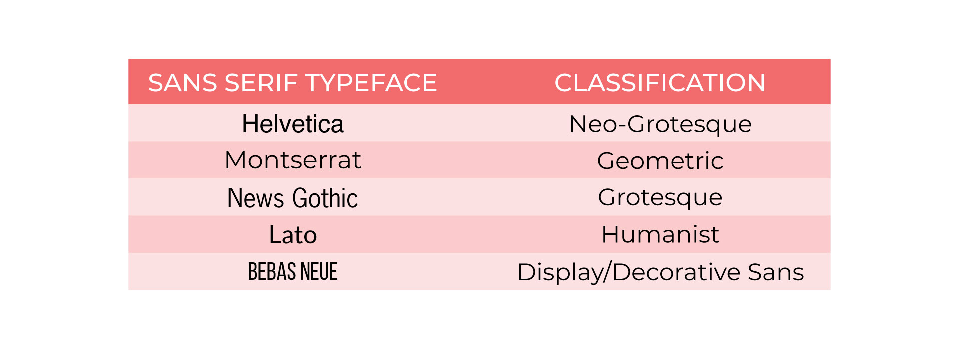
Which Typeface is Better?
Now you might be asking yourself, “so, which typeface category is better to use?” Well, either one could be better to use depending on how and why it’s being used. Therefore, let’s reframe that to, “which typeface category makes sense with what I’m designing?” To dive deeper, consider asking yourself the following questions:
- What am I designing? Is it a logo, sign, packaging, report, etc?
- What am I trying to convey with this piece? (personality and values) Are you trying to project confidence and knowledge, or maybe you want something more casual but bold and impactful? Are you trying to convey honesty, or friendliness?
- Is this piece for print or digital applications or both?
- Does it fit within your/client brand goals? If you are a tech company your font choices would likely be more reflective of knowledge, trustworthiness, maybe have a tech feel, rather than a font that’s more playful and childlike.
- How large will the font be seen? Is it going to only be small in an app or is this going on a large poster or sign? Either way you’ll want it easily readable.
The Wrap Up
There’s no one size fits all or a golden rule to live by. I’ve seen impactful headlines using serif typeface and other times sans serif typeface. I’ve seen body copy that I’ve struggled to read because it was using a serif typeface with very thin letterforms. That being said, consider first understanding what your goals are and then selecting typefaces to explore based on that. Test them and compare the typefaces you selected to see what works best to your eye. If you’re choosing a headline and body copy typeface, try mixing and matching the 2 categories. Maybe you’ll find the contrast between the two the perfect fit or maybe you’ll find it best to use the same typeface category for both. Either way, the information above is to provide some guidance and insight into the different typeface categories and how they’ve been commonly used. But hey, rules are meant to be broken, so have fun exploring and see what works for you!
If you found this article helpful please let me know by commenting below.
If you’re looking for help choosing fonts for your next project, reach out via social media or my website.
Happy creating!
~Ann Marie 🙂
Related Posts

Comments (0)