THE SEA BOX
Identity Design and Marketing Collateral
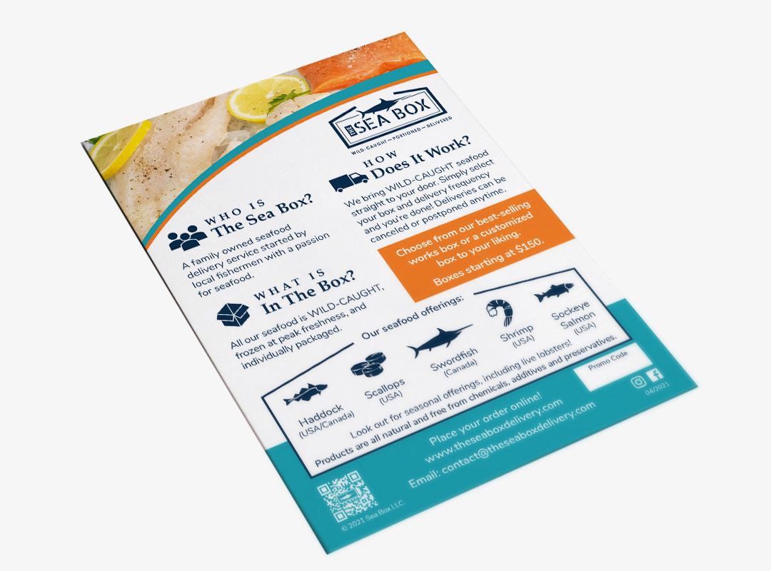
To develop a brand identity that clearly defined the company’s seafood niche and convey confidence.
For this logo we wanted to do something simple and to the point. The logo itself is an open box with a swordfish above, as if it’s being placed inside, which speaks to what they do. As fisherman that know the industry, we wanted to convey confidence and that these guys are hardworking. To achieve this we used a stencil like font, reminiscent of a stamp that goes on a wooden crate in a shipping yard. This font choice packs a big punch and tells customers, “we know what we’re doing.”
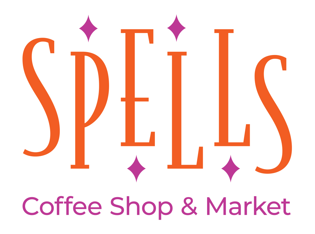
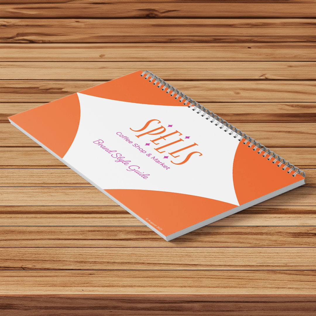
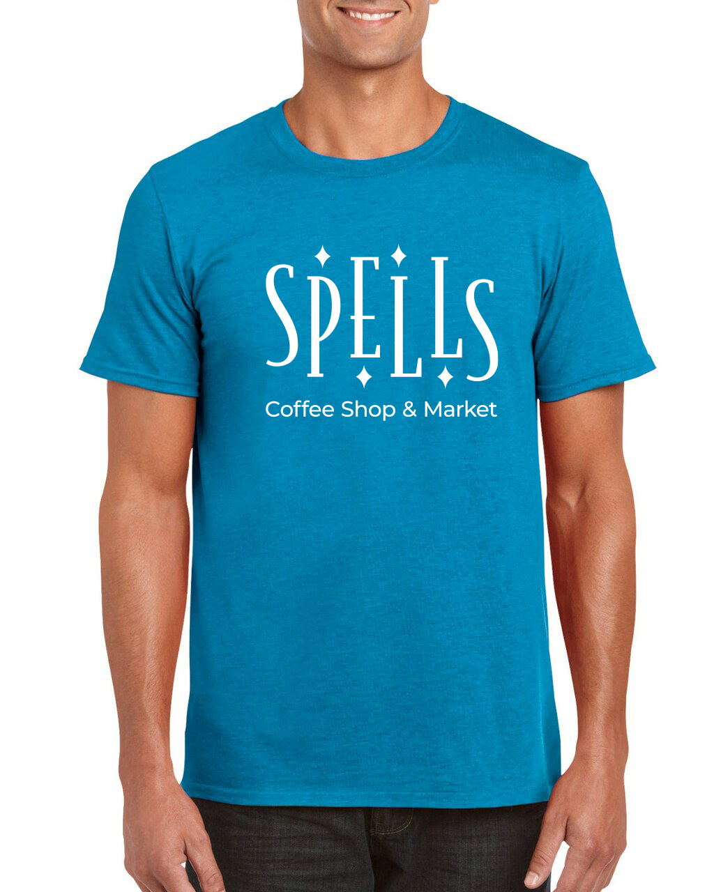
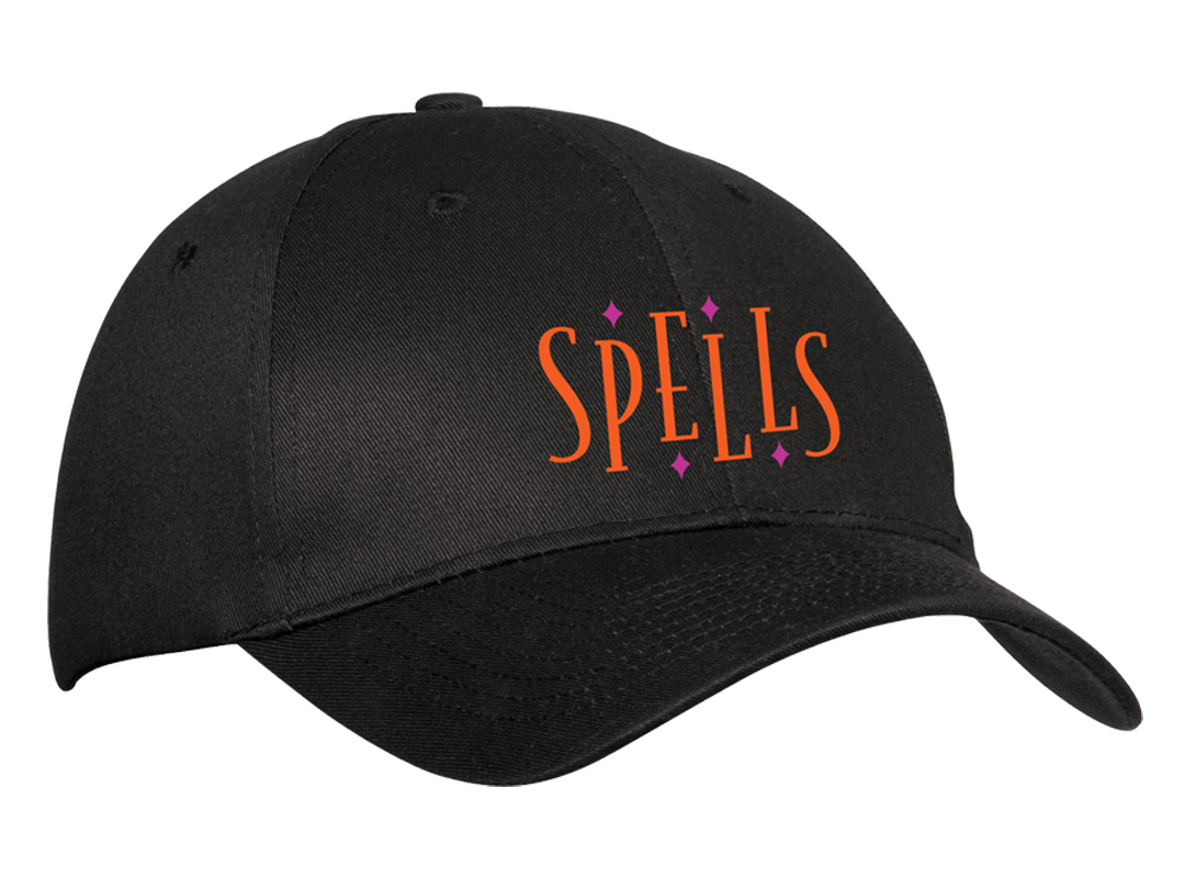
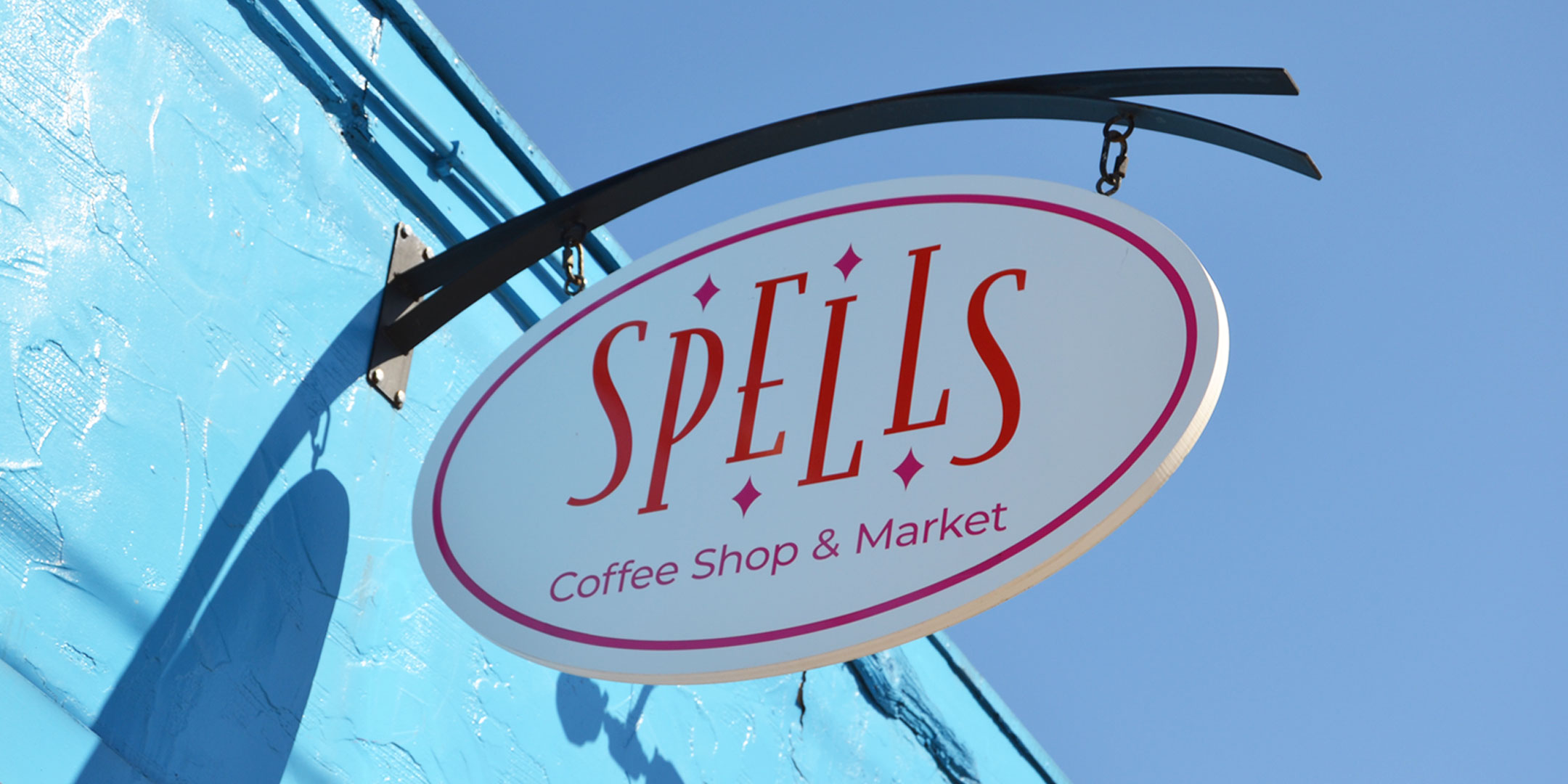
To develop a brand identity that embodied a whimsical, artistic feel while also conveying consistency and quality for the local coffee shop.
For this logo we wanted to delicately balance the whimsical feel with strength and stability. As a result we use chose to use a tall serif typeface that provided stability, conveying consistency and quality. By staggering the letters evenly and adding diamonds within some of the negative space, not only we were able to capture the whimsical artistic feel but it also offers a sense movement tapping in to the on-the-go customers they serve.
Plummer Youth Promise
Annual Report
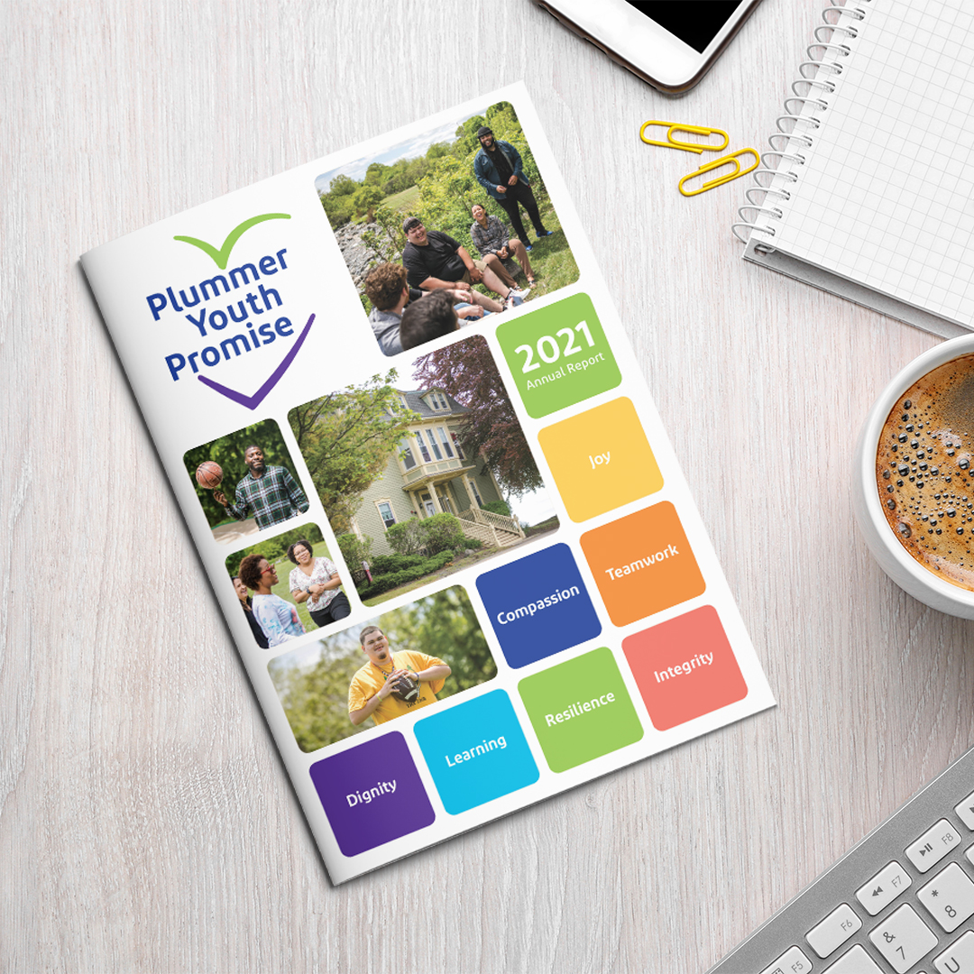
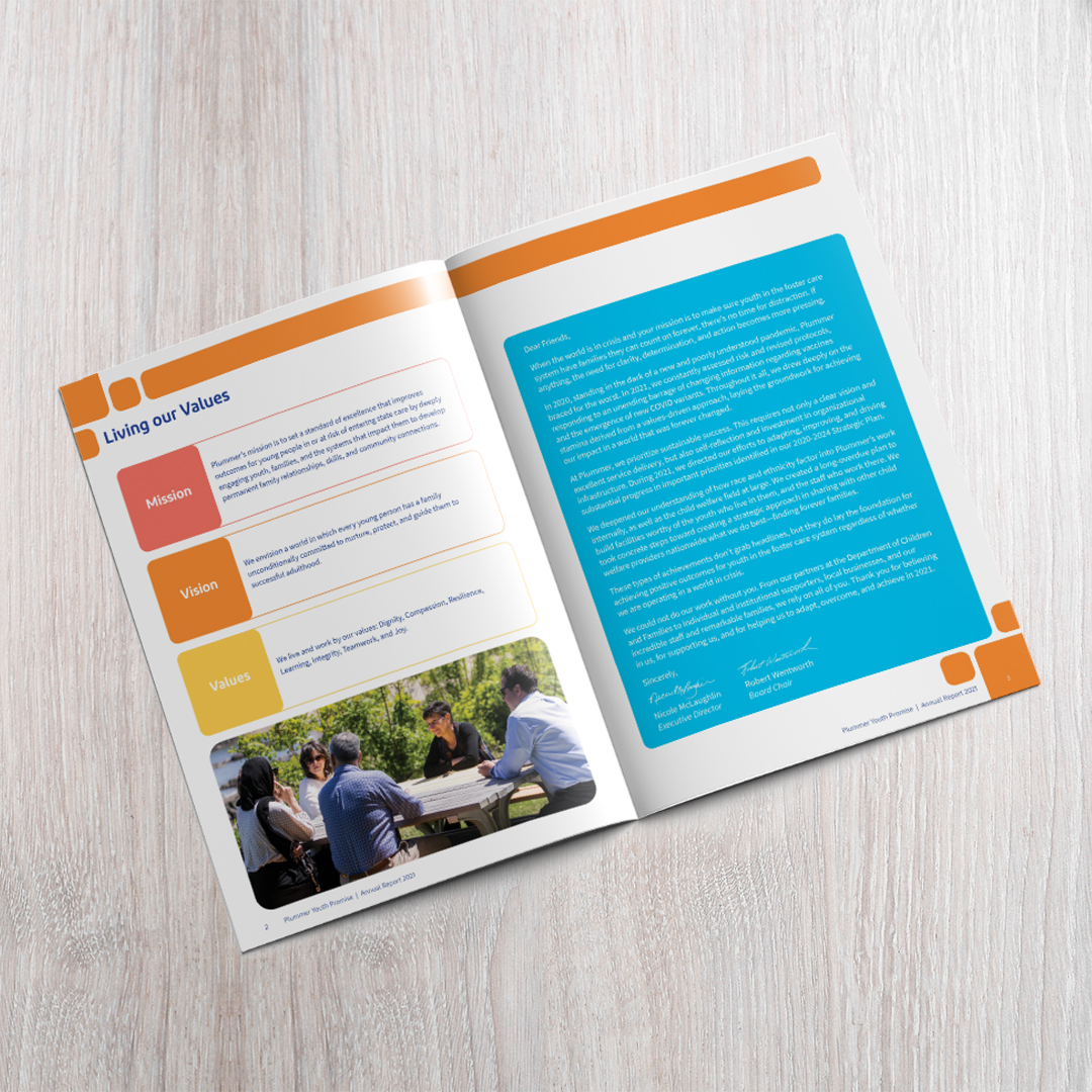
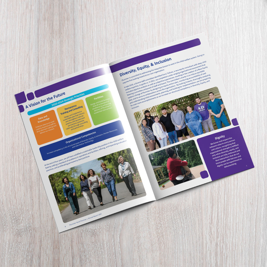
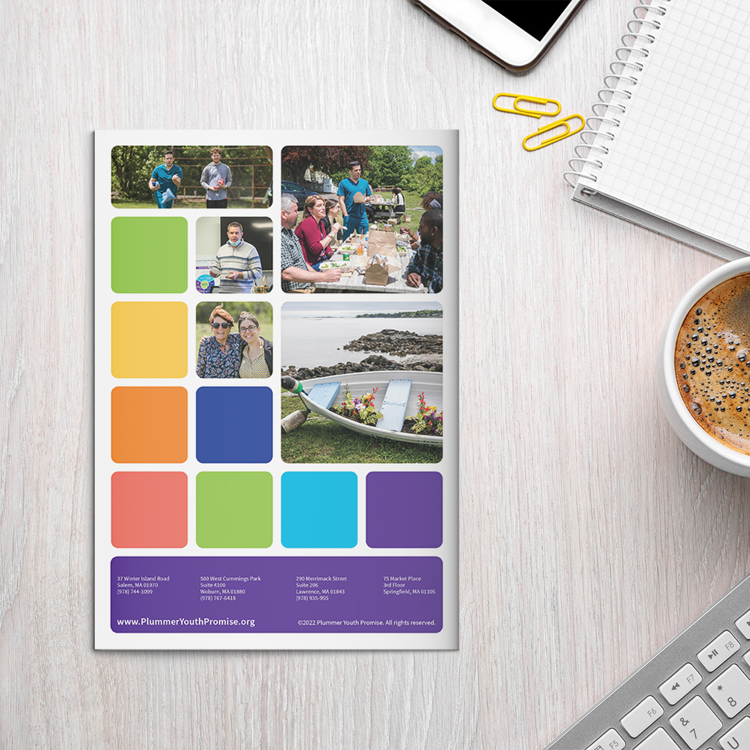
To design an annual report that highlighted the heart of what Plummer Youth Promise is all about and how these elements are the foundation of what makes them special.
We came up with a building block concept that utilized squares and rectangles to highlight keywords and information that reflects what make this organization special and unique. We rounded the corners of the shapes to offer a sense of softness and tie back to the curves in the Plummer logo. Since Plummer has a fun color palette, we chose a primary color for each spread. Each spread color was chosen based on the keyword being utilized on that spread to match the same keyword on the cover.
Tech Elevator
Identity Design and Marketing Collateral
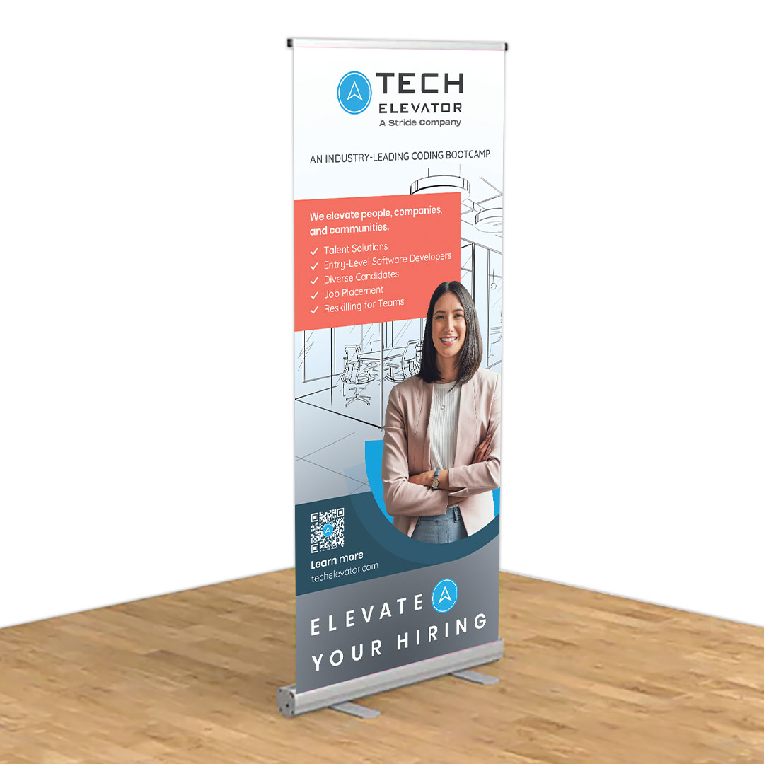
To design a retractable banner for events that highlighted Tech Elevator’s services, a logo for their Alumni Program and a logo for their 3,000 campaign celebrating their 3,000th student being placed in a Tech career.
The banner sign was designed to compliment their website by using the sketched room as a background and the half moon shapes to hold the student. To highlight their services in a clear manner, a checklist format was used.
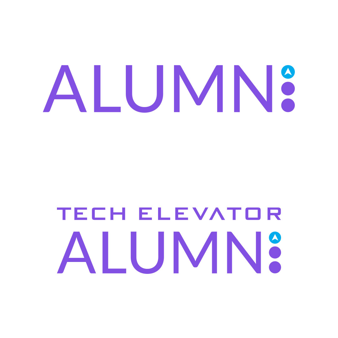
Since the Alumni is a segment of Tech Elevator and it’s is all about community, we designed this logo as a call back to the original TE brand by turning the letter “i” into a set of stacked circles, with top having the TE arrow, not only to convey elevator button but also to provide a sense of community.
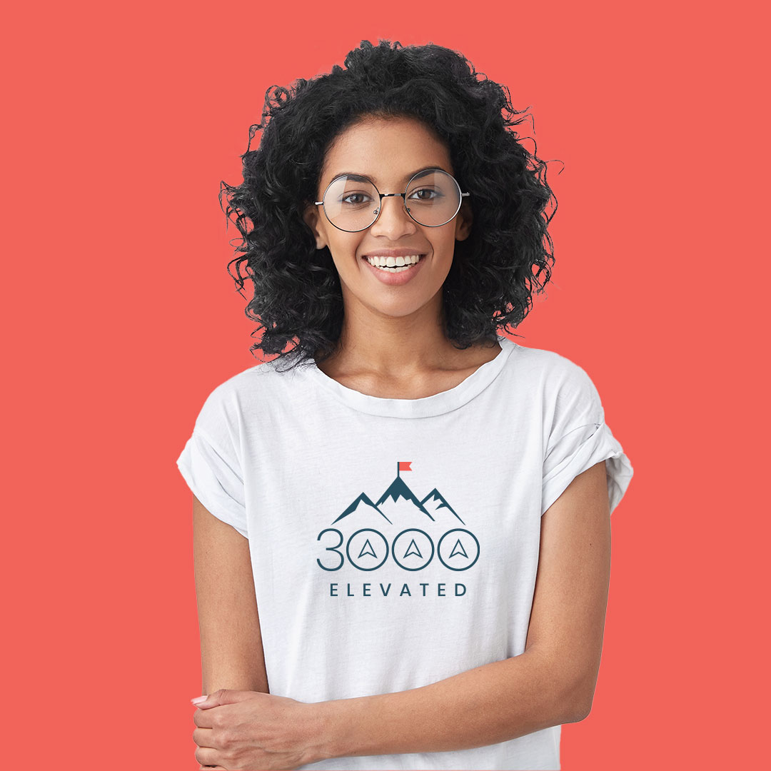
For the 3,000 campaign logo, a modern looking silhouette of a mountain range with a flag at the peak was used to convey that this milestone was a major achievement. Not just for the company but also for the ones that got placed in jobs after taking Tech Elevator’s bootcamp. We then overlayed 3,000 in large letters converting the zeros to elevator buttons which was nod to the main company logo.
FEND
Marketing Collateral
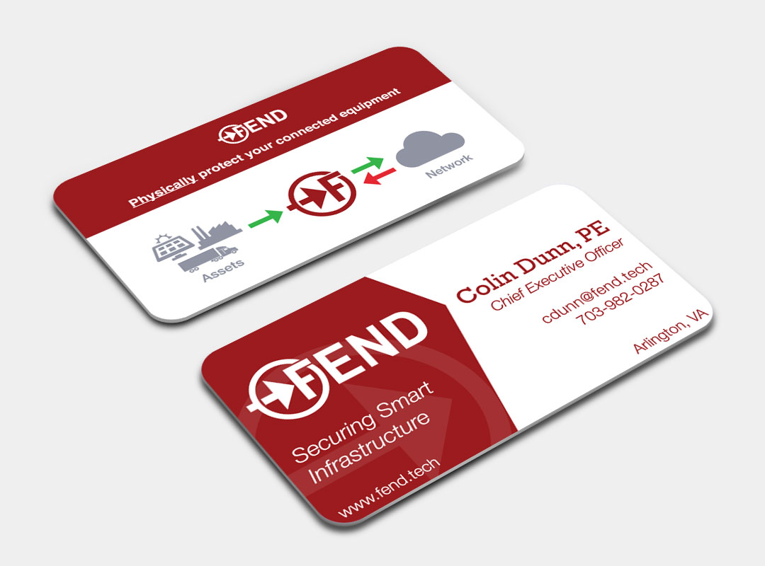
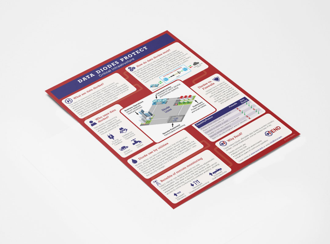
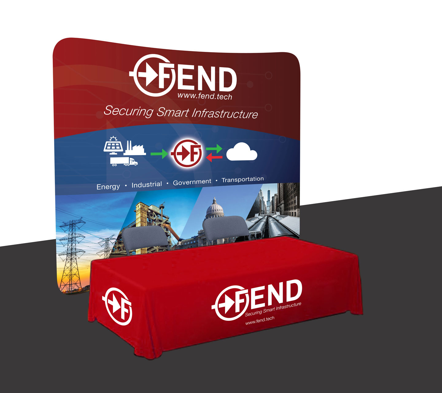
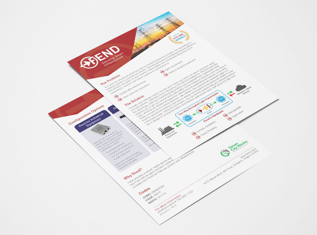
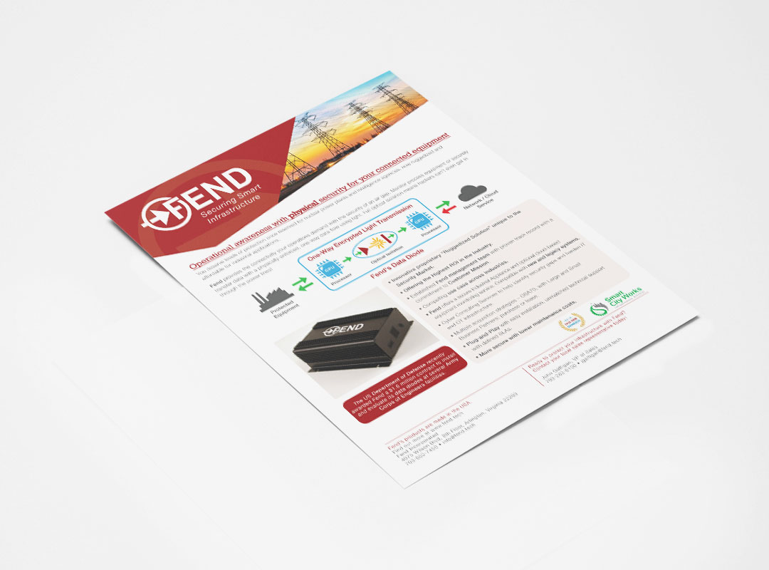
To develop a cohesive brand style based on their existing logo and use imagery that reflected their target audience that could then be carried throughout their marketing materials.
I focused on using their logo colors, specifically red, and the icon that was used in their logo to help drive the design solution. We also collected images that best represented their business and target audience to use across some of the marketing pieces as well, such as the sales sheet and trade show backdrop. As a result, all their materials have a cohesive look allowing it to be easily identifiable. As a result of taking this approach, Fend Inc.’s revenue has grown more than 5x in just one year!
Spark Growth Strategies
Marketing Collateral
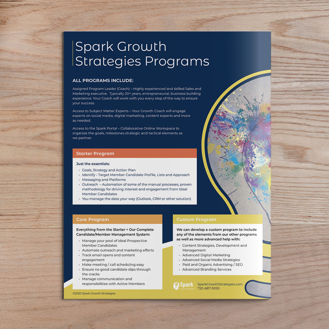
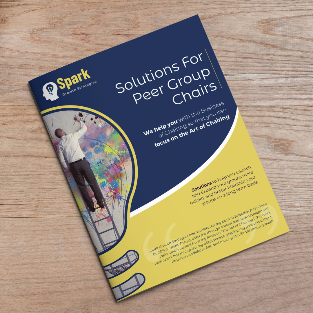
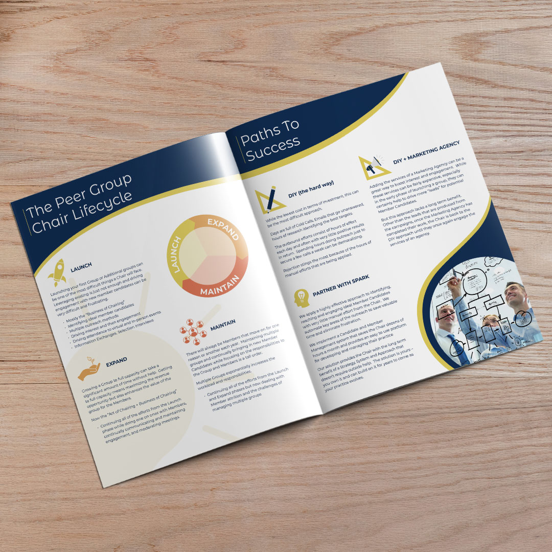
To develop a brochure that explains their Peer Advisory Program geared toward solo entrepreneurs.
A multi-page brochure that highlights the Peer Group Lifecycle, Paths to Success as well as the different levels of the program and what’s included. Since this brochure was content heavy, icons were illustrated and incorporated to help guide the reader through the brochure, making it a more digestible experience. These icons also helped further convey the topics being discussed.
TESSELLATI
Marketing Collateral
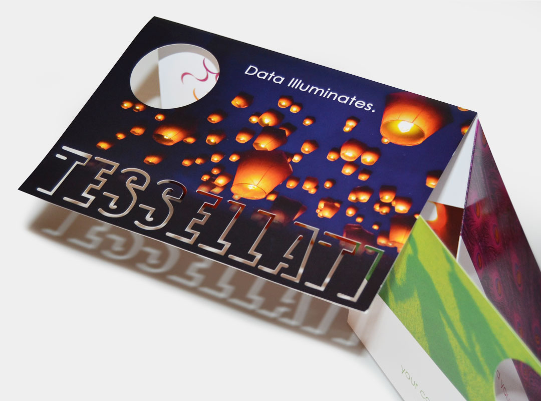
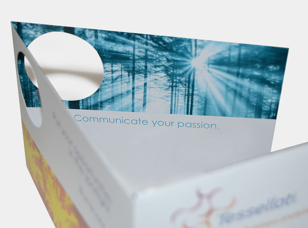
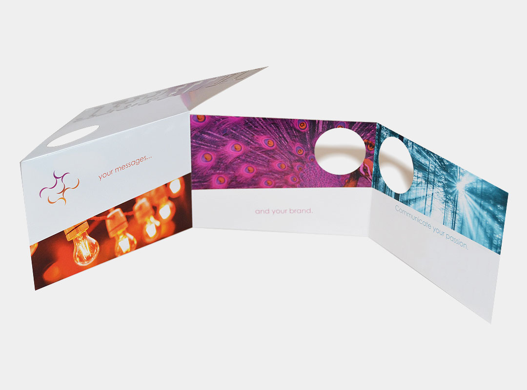
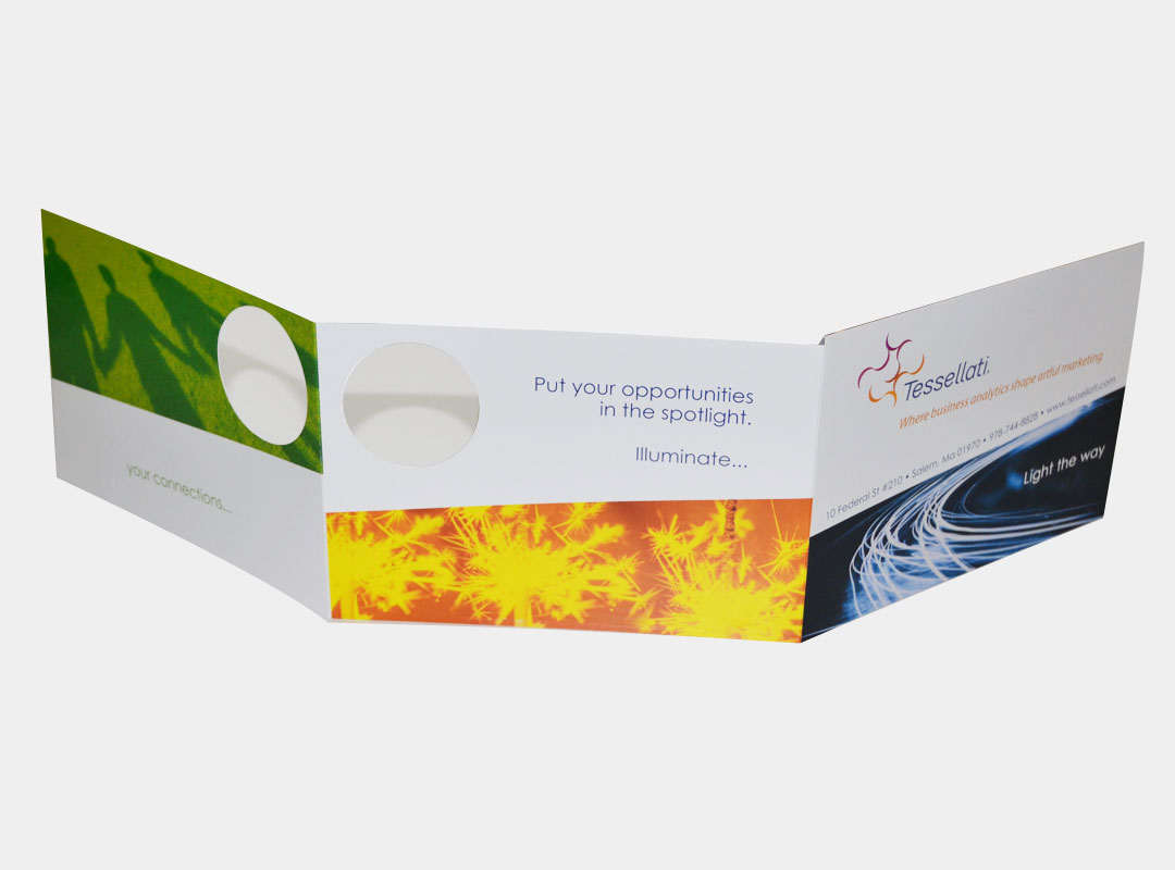
To design a marketing card that not only reflected the company’s use of repeating pattern but also the year’s chosen theme of “Illumination.”
A custom die-cut barrel fold card. In order to capture the illumination feel I designed the card to have the company’s name partially die-cut out of the cover allowing for the bright image on the next panel to shine through. To further display the illuminated theme, all the images throughout the card were bright and related to light as well as the company’s ongoing branding of using repeating patterns.
