Aloha Patch
Product Pouch Package Design
Design a package for their product that focused on the product description and used bright/colorful photography to convey a “new day” in how society is starting to openly accept CBD as a healing alternative.
A 4.82″w x 6.24″h pouch with a zipper seal and hang hole. Through using photo of a sunrise we were able to convey the “new day” concept that was also engaging. We also used bold heading to draw attention to the product name and bulleted list to clearly highlight the product description.



Fend
Product Box Package Design
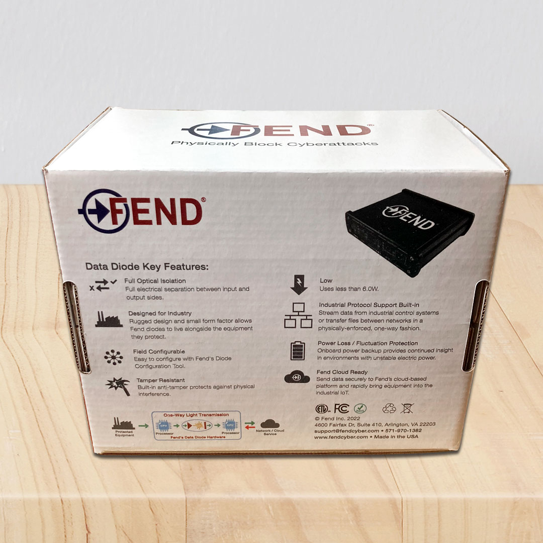
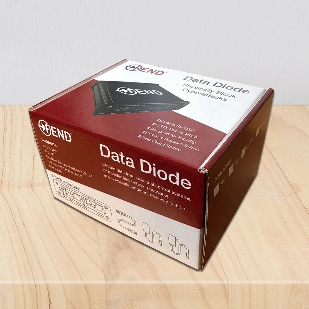
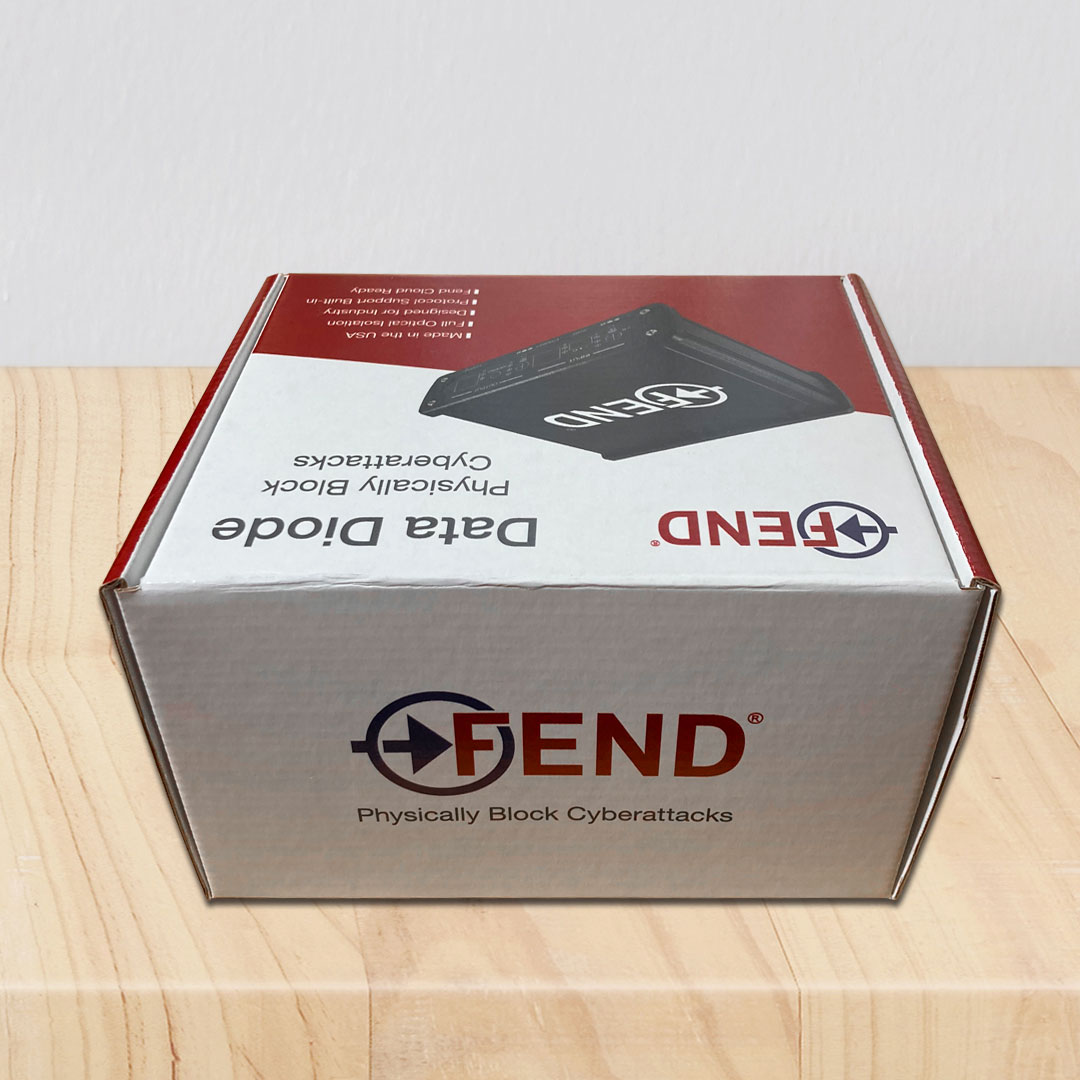
To design product packaging for Fend’s diode device that was simple yet engaging and informative.
A rigid cardboard box was chosen as the product package. For the overall design we took inspiration from their brand elements by using angled shapes on the top and front face to provide a simple but dynamic design. This was then complimented by the sides being all in red. The angled shapes were strategically placed to highlight information such as, what is included in the box and supported systems. By keeping the back area all in white, we were able to clearly list the products’ main features and benefits with accompanying icons. The top of the box, is finished with a large photo of the diode device.
Kirsten Manville
Album Package Design
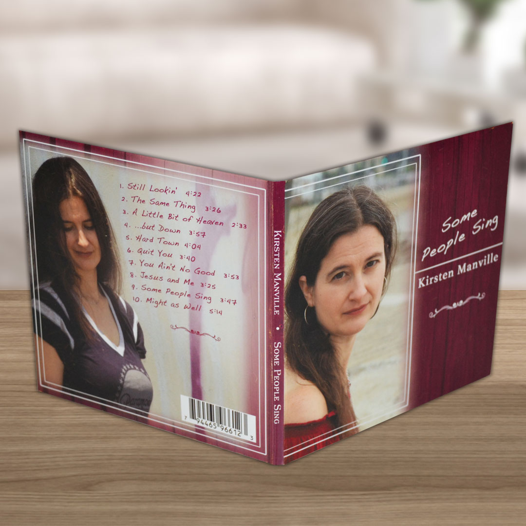
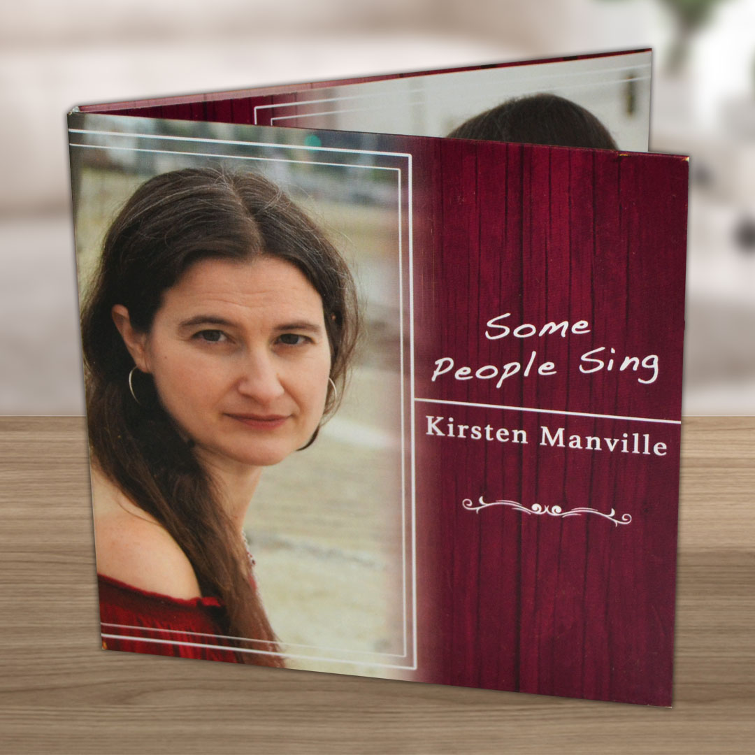
To design album packaging that reflected the music style of Kirsten country (folk feel with some Americana and blues in the mix).
A 4 panel digi-pak that focused on the country, folk elementsof the album tracks. I wanted to create an environment where listeners felt invited in when they opened up her album. Almost like they’re sitting in her living room for an intimate show. These feelings inspired me to frame in her photos and have lines coming from the frames that led the viewer through each panel of the album. To capture the country feel, I added a subtle wood texture as the backdrop throughout the piece. The purple/burgundy color palette was derived from the photography that had been done for the album, which I then used as a layer effect over the wood texture. To help further the country and songwriter feel I chose a handwritten font for the album title and a serif font for Kirsten’s name. Then finished it off with a simple decorative element to wrap it all together.

Don White
Book Dust Jacket Design
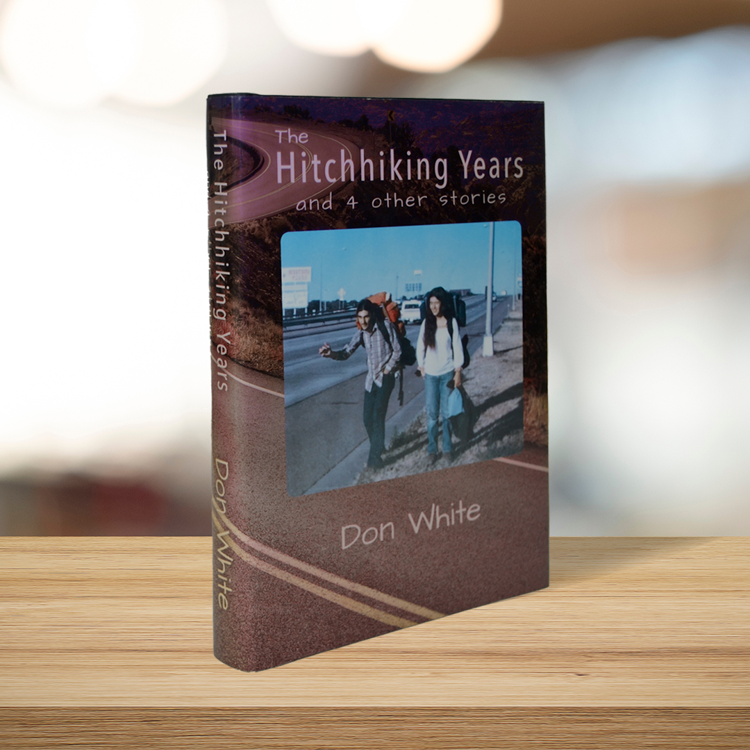
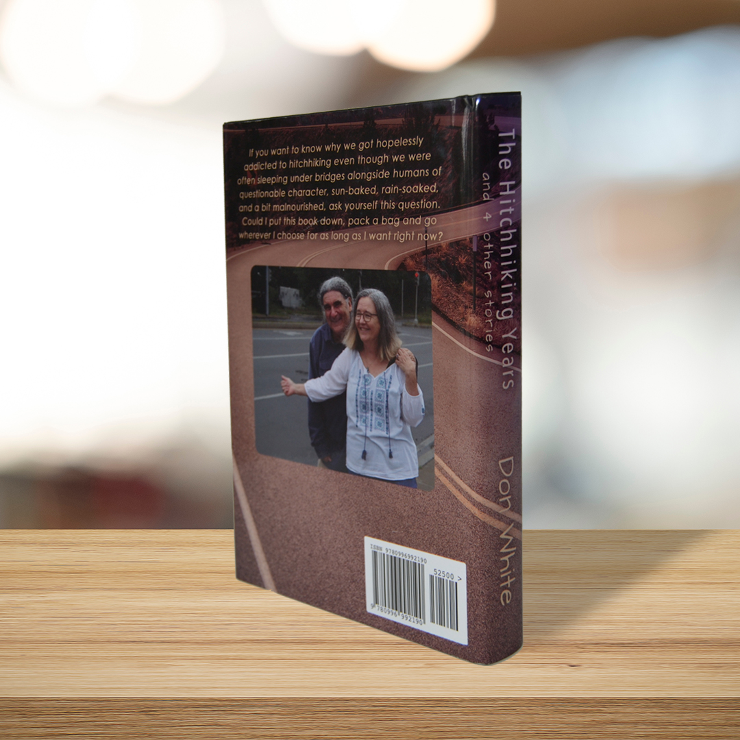
Design a book cover dust jacket that captured the heart of Don’s newest book, “The Hitchhiking Years and 4 other stories.” This book was a love letter to his wife, Theresa, as he reflected on the years they hitchhiked together across the U.S. Inside, Don remembers not just where they travelled but also the kind people they met along the way and the experiences they shared.
While this book does tell stories of people they met and where they travelled, we leaned into that this book was really Don and Theresa’s love story. As a result, we came up with the “then and now” concept where we used a photo of Don and Theresa from when they started hitchhiking in 1970’s for the front and then used a current day version of the photo for the back. We then chose a background image of a winding road to offer a sense of intrigue and to capture that these to went on a “journey.” Then, we pulled the sky blue gradient from the original photo for the background on the inside flaps.
