PROJECT OVERVIEW
Aloha Patch is an e-commerce start-up offering CBD wellness patches designed to support stress relief and immune response. The brand aimed to shift perceptions around CBD by presenting it as a natural, holistic healing option that feels accessible, uplifting, and modern.
As a newcomer in the expanding CBD market, the product’s physical packaging needed to clearly communicate the benefits and purpose of the patch while visually embodying the brand’s optimistic, welcoming ethos.
THE CHALLENGE
Aloha Patch entered a crowded and visually inconsistent CBD space. The primary challenge was not just to design packaging but to craft a visual narrative that:
- Educates consumers on what the product is and how it benefits them
- Frames CBD as a positive, empowering choice rather than something ambiguous
- Communicates a sense of freshness and welcome — a “new day” in holistic health perceptions
- Works both online and on retail display
- Balances aesthetic appeal with clear, functional messaging
The brand wanted packaging that looked engaging, empowering and holistic.

THE APPROACH
To meet these goals, the design approach focused on:
- Clarity of information — ensuring product description and benefits were easy to digest at a glance
- Visual storytelling — using imagery and color to evoke optimism, energy, and a natural wellness narrative
- Hierarchy and legibility — prioritizing how consumers read and process packaging copy in a retail or online context
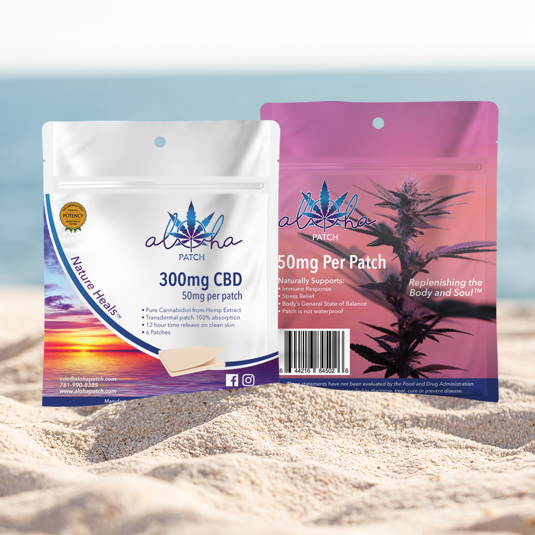
Photography and typography were key tools: the sunrise image suggested a fresh start and increasing acceptance, while clean layouts and bold headings guided attention to essential details.
THE SCOPE
- Packaging Research
- Packaging Design
- Vendor Management
THE IMPACT
The packaging delivers:
- A clear, compelling product presentation that positions Aloha Patch confidently in a competitive category
- Visual storytelling that communicates optimism and the brand’s holistic approach to wellness
- A design that is both retail-ready and easy to interpret at first glance, helping consumers connect emotionally and cognitively with the product
By bringing together thoughtful layout, engaging photography, and strategic messaging hierarchy, the packaging supports Aloha Patch’s mission of reframing CBD as a welcomed part of everyday wellness.
THE SOLUTION
The final design is a 4.82″w × 6.24″h resealable pouch with a zipper seal and hang hole chosen for retail versatility. Key features of the packaging:
- Sunrise imagery — reinforces the “new day” concept and conveys optimism about CBD’s role in wellness.
- Bold, clear product name treatment — instantly draws attention and sets a confident tone.
- Bulleted product description — visually simplified to help consumers quickly understand what the product does.
- Front/back information strategy — the back was designed to look different but equally informative, anticipating how products might be displayed (e.g., hung backwards) so essential information remains visible.
This solution balances visual appeal with functional clarity, supporting consumer understanding without overwhelming them.
