PROJECT OVERVIEW
Artistry & Industry is an umbrella company rooted in modern innovation, artistry, and empowerment. They are tackling global challenges by building a portfolio of businesses focused on sustainable, scalable, and socially impactful solutions that prioritize people, communities and the planet.
The brand needed a visual identity that reflected a balance of creativity and resilience, innovation and empowerment, while conveying confidence, approachability, and humanitarian values. The identity would communicate forward-thinking artistry alongside structured, dependable industrial strength. It reflects the company’s commitment to delivering positive, accessible, and practical solutions for real-world challenges.
THE CHALLENGE
Artistry & Industry did not yet have a defined brand identity. They needed a cohesive visual system that communicated its values:
- Innovative (Artistry / Creative): Show a forward-looking approach that challenges norms and provides creative solutions.
- Industrial (Confident / Resilient): Reflect strength, reliability, and confidence in solving complex problems.
- Humanitarian (Genuine / Accessible / Connected): Demonstrate empathy, transparency, and connection while committing to social and economic impact.
The goal was to design a system that could express these sometimes contrasting qualities — innovation, resilience, and humanity — in a single, coherent identity that works across multiple industries.

THE APPROACH
To define the visual story of A&I, we explored the brand’s values, story, audience, and long-term vision. We aimed to understand how the company approaches challenges, creates impact, and builds accessible solutions for communities.
From these insights, we developed:
- Strategic directions that aligned the brand’s personality with its portfolio’s diversity.
- Mood boards to visualize tone, style, and emotional resonance.
- Visual language options that balanced harmony with modern, minimal forms, combining confident structures with elements that reflect relationships and interconnectedness.
Typography, layout, and composition were carefully considered to communicate order and structure while allowing room for creativity and warmth.
SCOPE OF PROJECT
The brand identity system included:
- Brand Strategy – Defining mission, vision, positioning, and the brand narrative that shaped all creative decisions.
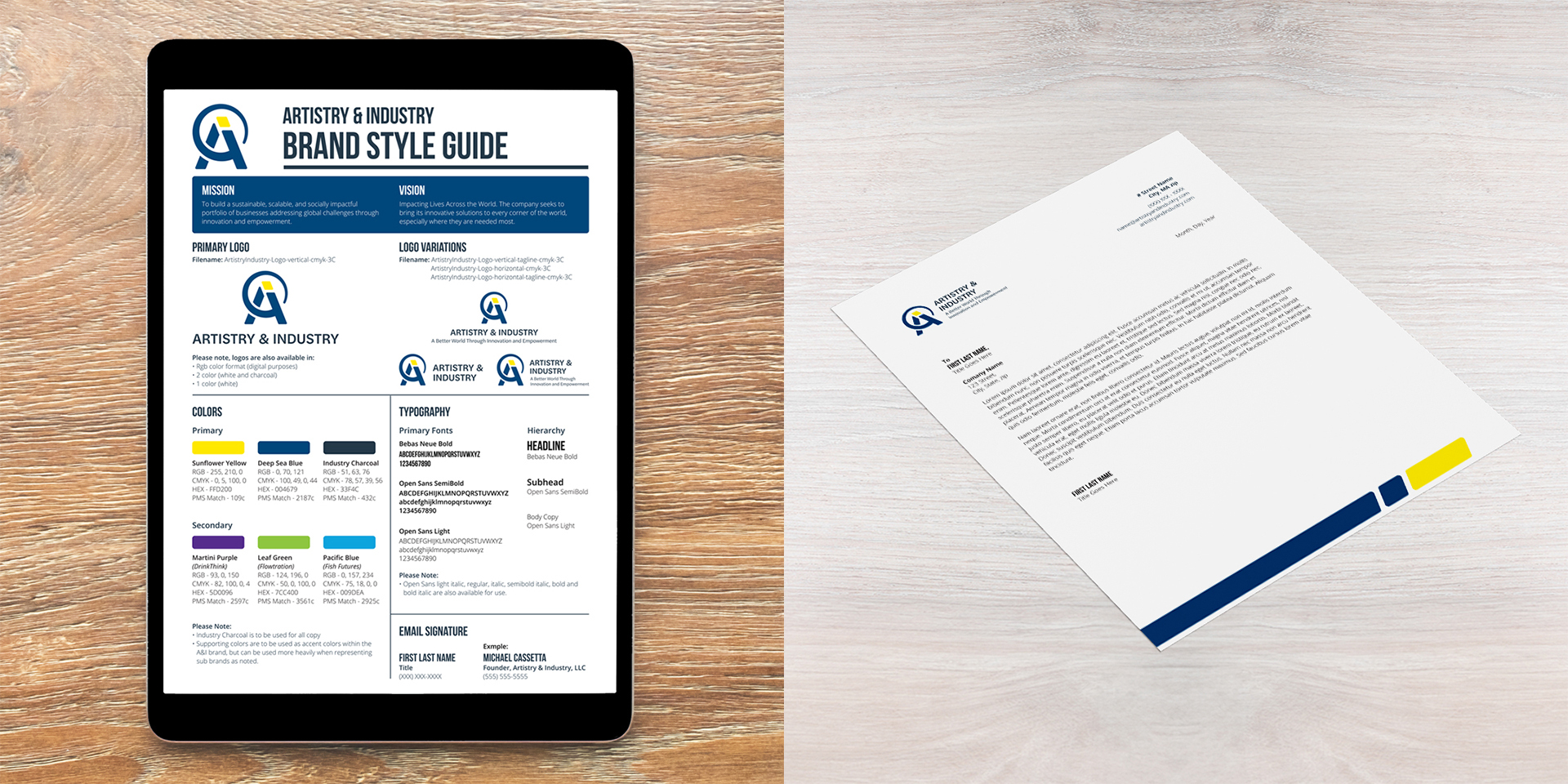
- Visual Identity – Logo system, color palette, typography, and email signature.
- Visual Identity PDF – A PDF of standards, outlining the logo system and color palette.
- Letterhead Design – A refined, print-ready layout to support professional communication.
THE SOLUTION
I developed a visual brand identity system that embodies the harmony between artistry and structured design. The visuals emphasize forward-thinking innovation and industrial strength while reflecting a global impact mindset and the importance of relationships, expressed through the interconnected letterforms and the larger circular swoop that wraps around the “A” and intersects with the “i.” By breaking the company’s initials into separate, evenly spaced pieces, the design conveys how A&I functions as an umbrella organization composed of businesses with a shared mission. The dot of the “i” is highlighted in yellow to symbolize innovation — a “spark of an idea.” The result is a versatile, cohesive identity that unifies the company’s portfolio and supports its growth.
The logo was paired with a with a strong sans serif word mark that echoes the icon’s structure. The flat-top “A” mirrors the “A” in the logo, while rounded details in letters like the leg of the “R” references the circular swoop of the icon. This choice projects professionalism and stability while maintaining subtle artistry, reflecting the brand’s confidence and its commitment to people and communities.
THE IMPACT
The new identity gives Artistry & Industry:
- Provides a professional, cohesive visual foundation – Supports future product lines or collaborations with a flexible brand system
- Communicates the brand’s mission and tone with a distinctive aesthetic
- Works seamlessly across print, digital, and merchandise
With this clarity and structure in place, the brand is positioned to show up consistently, credibly, and creatively across every touchpoint.
