PROJECT OVERVIEW
BelleSoul Aesthetics is a boutique aesthetic care practice built on trust, connection, and holistic wellness. Led by a licensed Nurse Practitioner, BelleSoul provides non-aggressive, high-quality treatments that prioritize safety, education, and natural results. The brand is rooted in creating a welcoming, family-like environment where clients feel heard, supported, and confident—enhancing their natural beauty rather than transforming it.
The brand needed a visual identity that conveyed medical credibility, quality, and trust while remaining warm, inviting, and approachable. With a broad audience spanning from their mid-20s to 70s, the identity needed to feel timeless and conservative—focused on longevity rather than trends. The visual system reflects BelleSoul’s mission through calming colors, refined typography, and an understated aesthetic that communicates confidence, care, and a commitment to natural beauty.
THE CHALLENGE
BelleSoul Aesthetics needed a cohesive brand identity that clearly communicated its philosophy and standards of care in an industry often driven by trends and transformation. As a medically led practice, the brand required a visual system that balanced professionalism and warmth—instilling confidence while remaining approachable and inclusive.
The identity needed to express three core values:
- Quality (Medical / Conservative): Communicate licensed medical expertise, experience, and a conservative approach to aesthetic care. The brand needed to signal restraint and intention—prioritizing safety, non-aggressive treatments, and long-term results over trend-driven procedures.
- Trustworthy (Connected / Reassuring): Reflect an environment where clients feel heard, comfortable, and safe. The identity needed to support relationship-building and convey empathy, care, and confidence—especially for first-time clients who may feel nervous or uncertain.
- Inclusive (Diverse / Timeless): Appeal to a wide range of clients across gender, skin type, and age. With a primary audience spanning ages 25–70, the brand needed to feel timeless rather than trendy, welcoming rather than exclusive, and aligned with enhancing natural beauty rather than transformation.
The challenge was to design a visual system that unified medical credibility, emotional trust, and inclusivity—creating a refined, calming identity that reinforces BelleSoul’s commitment to quality care, meaningful relationships, and natural results.


THE APPROACH
To define the visual story of BelleSoul Aesthetics, we explored the brand’s values, philosophy of care, audience, and long-term vision. We sought to understand how BelleSoul builds trust, approaches aesthetic treatments conservatively, and creates a safe, welcoming environment rooted in education, quality, and connection.
From these insights, we developed:
- Strategic directions that aligned medical credibility with warmth, reflecting BelleSoul’s holistic, non-aggressive approach to aesthetic care.
- Mood boards to visualize a calm, refined, and inclusive tone that communicates trust, safety, and natural beauty.
- A visual language that balances softness with structure—pairing organic elements with clean, restrained forms to avoid trend-driven or overly clinical aesthetics.
- Color, typography, and composition were carefully considered to convey confidence, approachability, and longevity. Calming tones, balanced neutrals, and complementary type styles work together to reflect BelleSoul’s commitment to quality care, meaningful relationships, and enhancing what is naturally present—never transforming it.

THE SOLUTION
The solution was a cohesive visual identity that balances warmth and approachability with medical credibility and restraint—reflecting BelleSoul’s holistic, non-aggressive approach to aesthetic care.
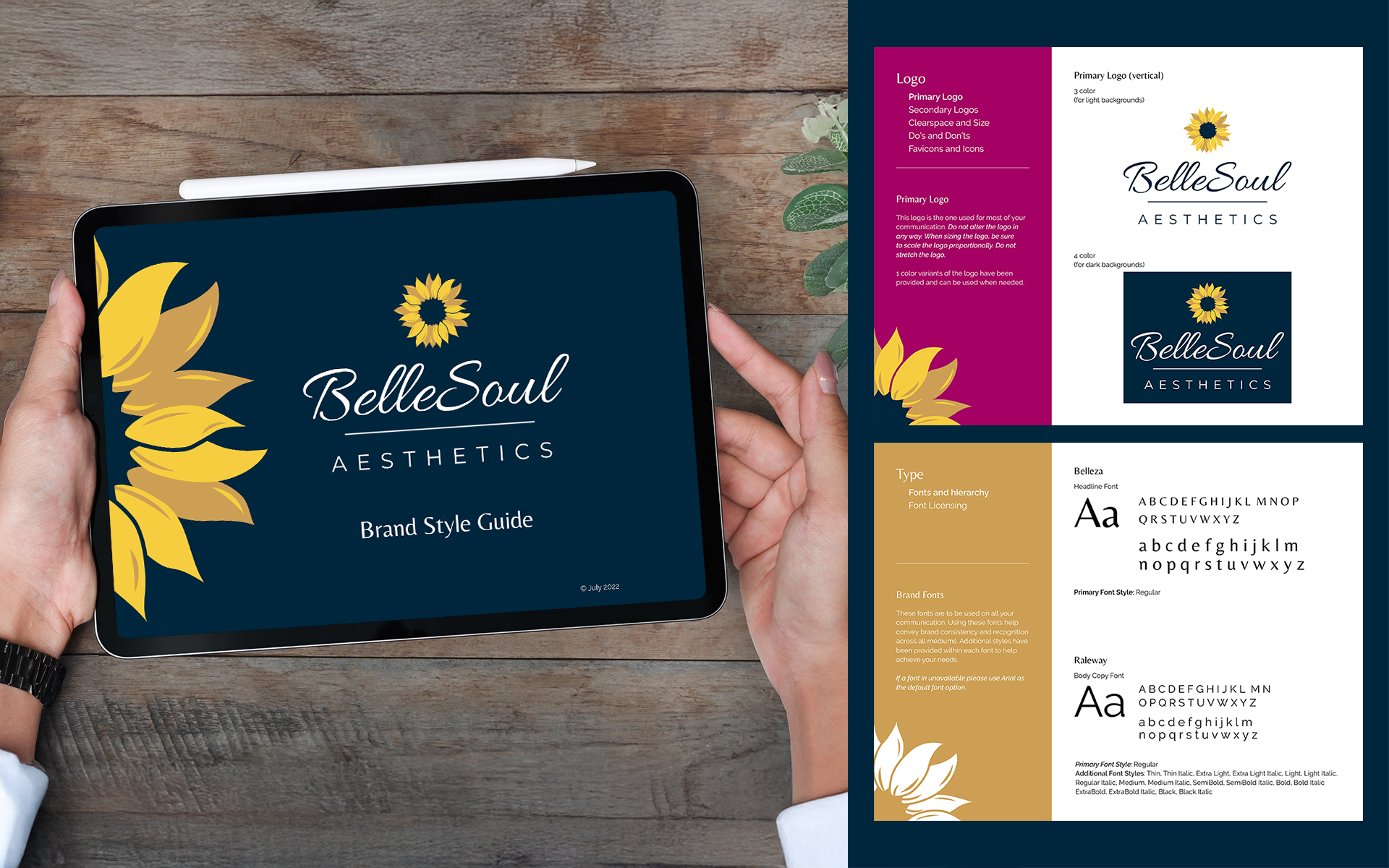
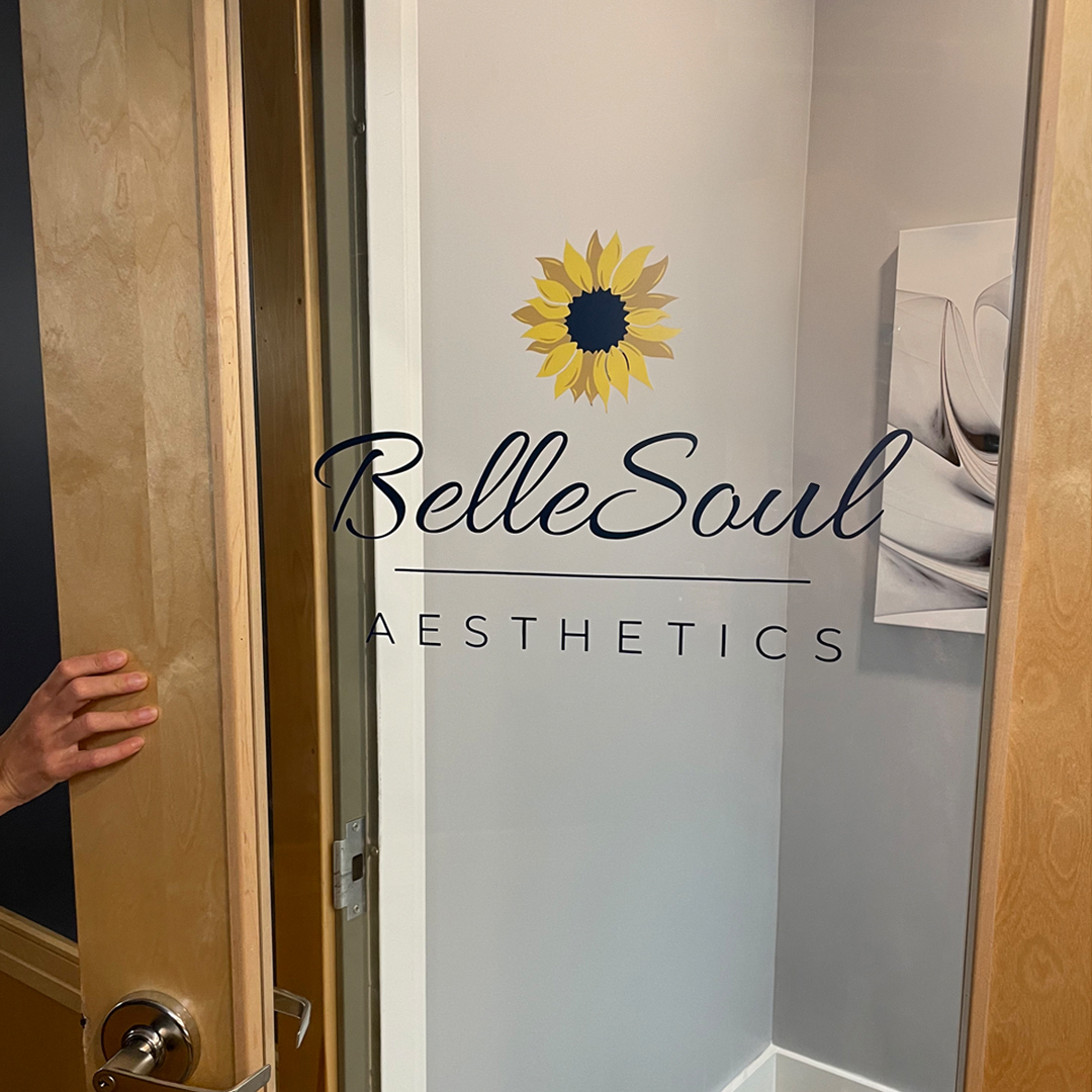
A sunflower was chosen as the primary logo element to symbolize natural beauty, loyalty, and connection. Its flowing, interconnected petals reinforce the brand’s emphasis on comfort, trust, and long-term relationships.
The typography pairs a soft script for “BelleSoul” with a clean sans serif for “Aesthetics,” creating a balance between care and professionalism. Subtle structural elements, including the sunflower placement and horizontal line, introduce a modern, refined feel while reinforcing balance and intention.
The final identity is calm, timeless, and confident—aligning BelleSoul’s visual presence with its mission to enhance natural beauty through quality, trust, and thoughtful care.
SCOPE OF PROJECT
The brand identity system included:
- Brand Strategy – Defining mission, vision, values, and the brand narrative that shaped all creative decisions.
- Visual Identity – Logo system, color palette, typography, and iconography.
- Brand Style Guide PDF – A comprehensive guide outlining brand foundations, logo system and usage rules, color palette, typography, visual tone, and application standards to ensure consistency across print and digital platforms.
- Business Appointment Cards – Professionally designed, print-ready cards to support client appointments and reinforce brand presence.
THE IMPACT
The new BelleSoul identity gives the brand:
- A professional, cohesive visual foundation – Supports growth and future initiatives with a flexible brand system
- A distinctive aesthetic that communicates mission and tone – Reflects empowerment, authenticity, and soulful connection
- Seamless application across print, digital, and appointment materials – Ensures every touchpoint feels intentional and on-brand
With this clarity and structure in place, BelleSoul is positioned to show up consistently, credibly, and creatively for its audience.
