PROJECT OVERVIEW
Cadence Craft Brewed Soda is a self-initiated, music-inspired craft soda brand. The concept explores the intersection of music and flavor, imagining what music would taste like and how it could be represented as beverage packaging.
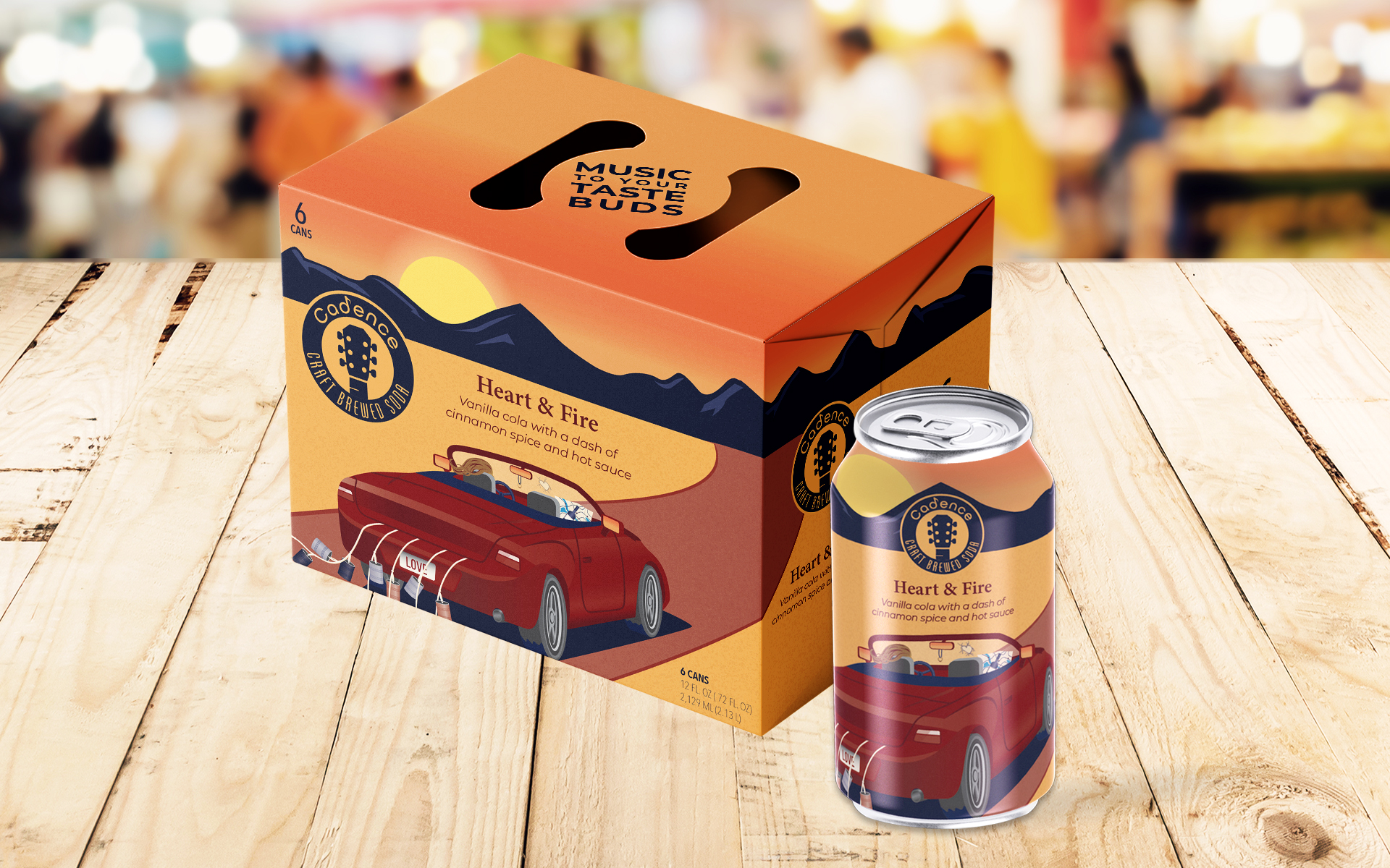
The project required developing a brand identity, designing a beverage can wrap, retail packaging, and social media ads — all inspired by one of my favorite albums.
THE CHALLENGE
The primary challenge was to translate the emotion, rhythm, and narrative of music into a visual and tactile experience. Key objectives included:
- Creating a soda brand and logo that reflects the musical theme and concept
- Developing packaging that tells a story while remaining visually striking and legible
- Extending the concept across multiple touchpoints, including retail packaging and social media
- Ensuring the design communicates personality, emotion, and the spirit of the album chosen

THE APPROACH
The design approach focused on storytelling, symbolism, and musical inspiration:
- Selecting an album with personal significance to provide a clear narrative and emotional anchor
- Translating musical elements into visual motifs for the logo, typography, and packaging
- Using illustration to embed subtle references and “Easter eggs” that connect to the songs on the album
- Choosing colors and typefaces to reflect both the personality of the music and the overall brand concept
Every element was designed to make the experience immersive, playful, and musically driven.
THE SOLUTION
The final concept brought together brand identity, illustration, and packaging:
- Brand Name & Logo: The name “Cadence” reflects musical rhythm. The logo features a circle with a guitar headstock rising through the center, tying directly to the musical theme.
- Typography: Two sans serif fonts were chosen — a modern, wide letterform for “Cadence” with the “d” converted into a music note, paired with a condensed, Art Deco-inspired font for “Craft Brewed Soda.” The contrast conveys how music transcends time and genres.
- Illustration: Inspired by Reba McEntire’s album What If It’s You, the can illustration depicts a car driving down a desert road toward the mountains, with subtle nods to album tracks embedded throughout (tin cans, class ring, “LOVE” license plate). Red was selected as the primary color to reflect Reba’s fiery personality and iconic hair.
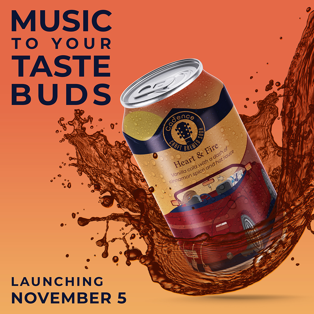
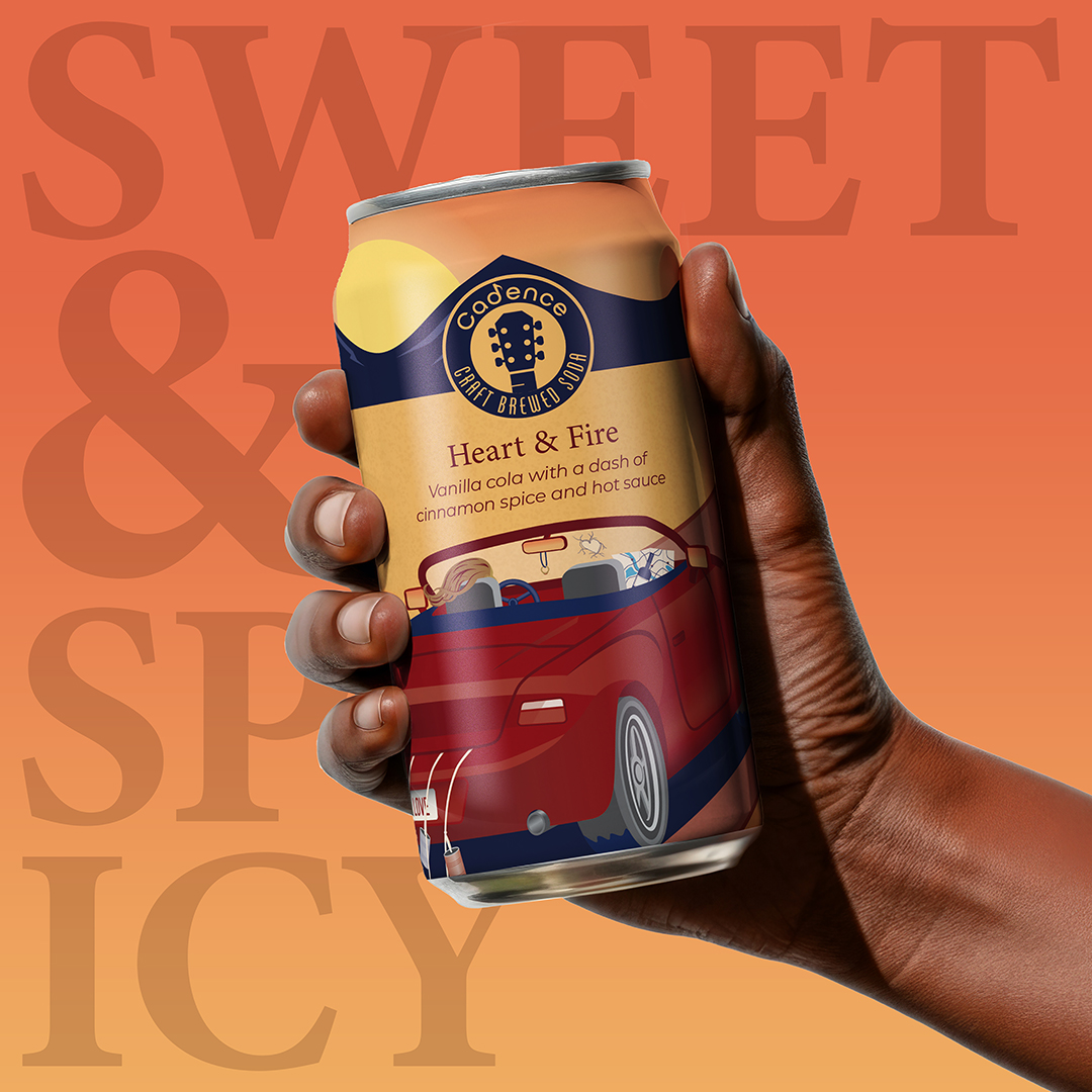
- Extended Assets: The can design inspired the box packaging and social media visuals, creating a consistent, immersive brand story across all touch points.


SCOPE OF PROJECT
- Project Concept
- Brand Identity
- Package Design
- Social Media Posts
IMPACT
The project demonstrates:
- Creative exploration of brand storytelling through music and design
- Ability to translate emotional narrative into visual identity and packaging
- Cohesive multi-touchpoint design, from illustration to retail and social media
- A showcase of personal design philosophy, process, and experimentation
This self-initiated project highlights the ability to blend concept, story, and craft into a visually compelling brand experience.
