PROJECT OVERVIEW
Fend Inc. is a cybersecurity firm specializing in hardware-based protection for industrial and operational networks. Their solutions physically enforce data security in critical sectors including utilities, government infrastructure, manufacturing, and other environments where traditional software defenses may be insufficient.
Fend needed a unified visual identity for its marketing and product packaging that would reinforce credibility while resonating with technical, infrastructure-focused audiences.
THE CHALLENGE
Fend’s existing logo was strong, but the visual language across marketing collateral and product packaging was inconsistent or undeveloped. The core challenges were:
- Extend the logo into a cohesive visual style that could be applied to collateral and packaging
- Create materials that clearly spoke to industrial, government, and technical buyers
- Translate complex cybersecurity concepts into accessible, visually engaging formats
- Maintain professional clarity across trade show, sales, and product contexts
This required balancing technical precision with visual clarity for both digital and physical applications.

THE APPROACH
To address these challenges, the design strategy focused on:
- Brand continuity: Building on Fend’s existing color palette and directional elements from their logo
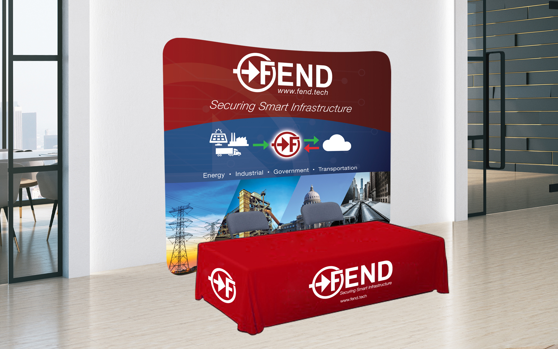
- Visual relevance: Using imagery of infrastructure — such as power lines and facilities — to connect materials to the environments Fend protects
- Hierarchy & clarity: Designing layouts that help audiences quickly grasp key product information
- Scalability: Ensuring visual systems worked from small printed collateral to large trade show backdrops
This approach allowed the brand to feel consistent and credible across formats without resorting to generic tech visuals.
THE SOLUTION
The result was a suite of materials and packaging that feel unified, purposeful, and technically grounded:
Visual Identity & Marketing Collateral
- Core brand color red was used prominently to create a consistent and recognizable palette
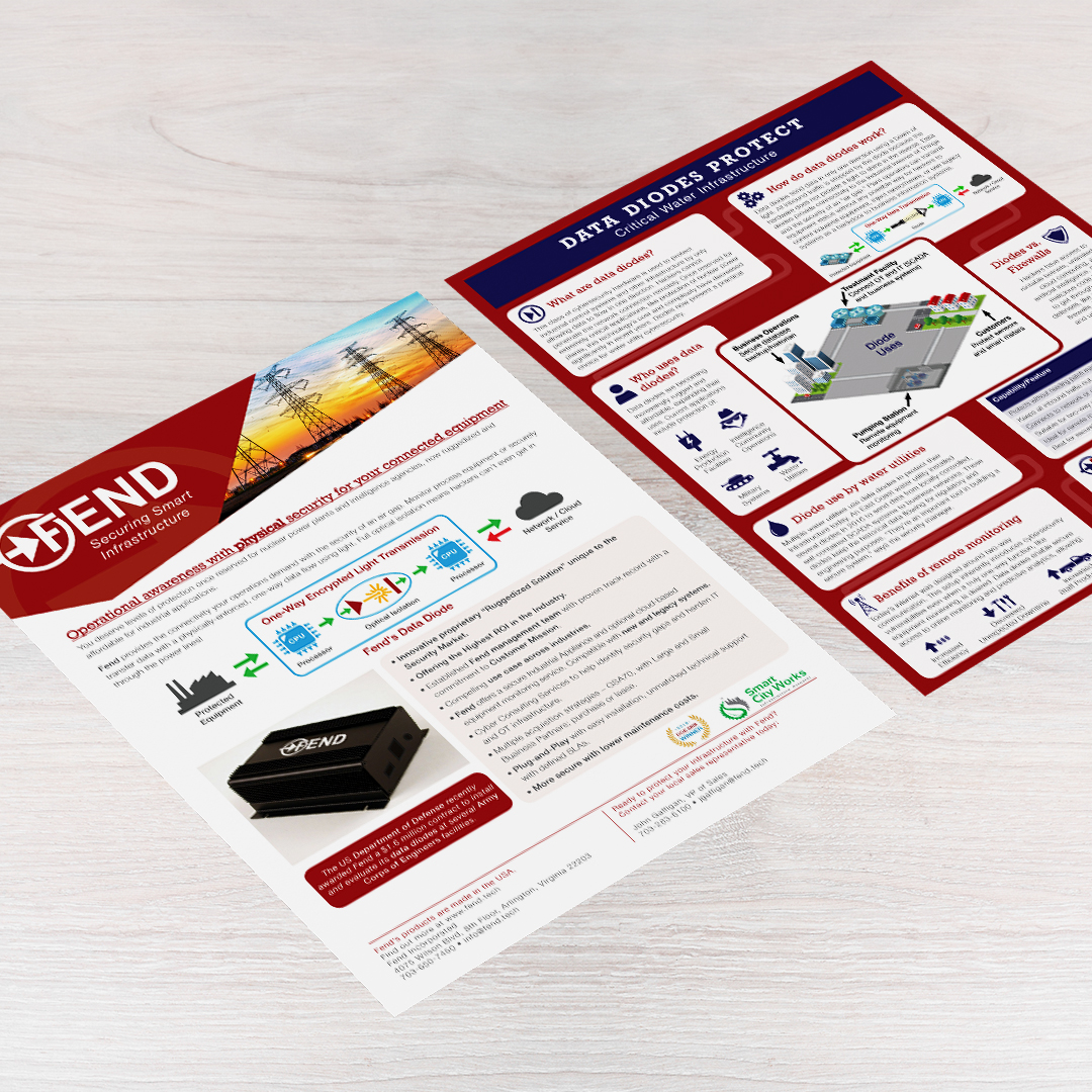
- Angled shapes — inspired by the arrow forms in Fend’s logo — were integrated into layouts to suggest precision and forward momentum
- Curated images of infrastructure sectors (energy, transport, government buildings) were incorporated across trade show materials, sales sheets, and postcards to visually link the brand to its real-world applications
- Across all assets, strong typographic hierarchy ensured important information could be scanned quickly and with confidence
Product Packaging
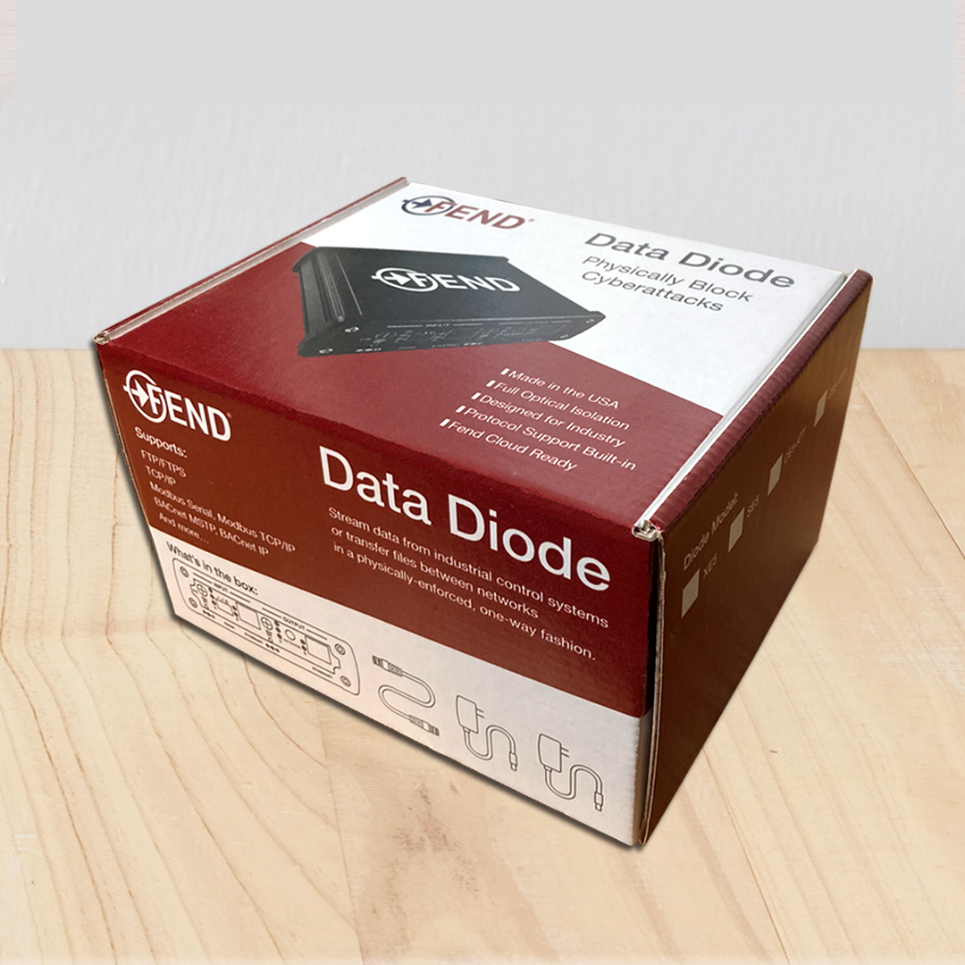
- A rigid cardboard box was selected for the diode device to convey durability and protection
- Angled brand elements wrapped the top and front face to visually organize key content such as included components and system compatibility
- Red side panels reinforced brand presence, while a clear white area on the back allowed detailed features and benefits to be listed with accompanying icons
- A large device photograph on the top provided immediate clarity about what’s inside
Together, these elements created a visual system that feels connected to the product’s purpose and the audience’s expectations without overstating claims.


SCOPE OF PROJECT
- Brand & Marketing Collateral
- Business Cards
- Sales Sheets
- Postcards
- Trade Show Booth Backdrops
- Product Packaging
