PROJECT OVERVIEW
Maine Pie Co. is a Maine-based food company operating a designated gluten-free kitchen, producing lab-certified gluten-free pies, tarts, and pie crusts. Founded by a husband-and-wife team, the company was created in response to growing customer demand for high-quality gluten-free dessert options that don’t compromise on taste or craftsmanship.
As the brand expanded its offerings and introduced new products, Maine Pie Co. needed marketing collateral and packaging that clearly communicated dietary information while reflecting the warmth, care, and homemade feel behind the brand.
THE CHALLENGE
Maine Pie Co. needed to visually communicate multiple priorities at once:
- Clearly identify products as gluten-free (and dairy-free where applicable) for consumer confidence
- Showcase the quality and appeal of the products themselves
- Maintain a handcrafted, homemade aesthetic that reflects the brand’s origins
- Extend the existing brand system consistently across marketing materials and new product packaging
For their new Ready to Roll Pie Dough, the packaging also needed to introduce the product clearly while helping customers immediately understand what was inside.

THE APPROACH
The design approach focused on clarity, authenticity, and brand continuity. Key considerations included:
- Using real product and ingredient imagery to reinforce freshness and quality
- Leaning into existing brand elements to maintain recognition and cohesion
- Creating clear visual hierarchy so dietary information is immediately noticeable
- Designing packaging that allows the product to be seen, reducing uncertainty for consumers
Every decision aimed to balance function and warmth — ensuring the designs felt both informative and inviting.
THE SOLUTION
The final solution resulted in a cohesive suite of marketing collateral and packaging that highlights both the product and the brand’s values.
Across marketing materials, real photography of pies and ingredients was paired with wood-grain backgrounds to reinforce a handcrafted, homemade feel. The brand’s handwritten-style font was used selectively alongside a clean sans serif to draw attention to key messaging while maintaining readability and structure.
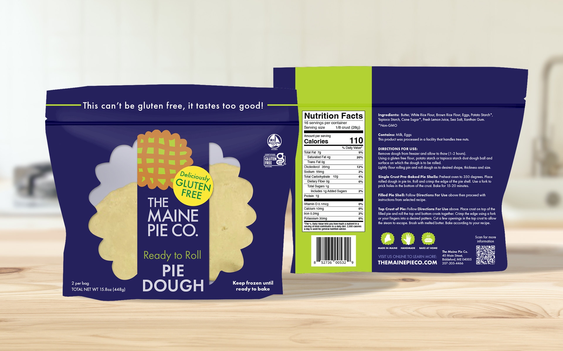
For the Ready to Roll Pie Dough packaging, Maine Pie Co.’s primary brand colors — navy and bright green — were used as the foundation. Instead of relying on photography, the pie-shaped icon from the logo was repurposed as a viewing window, allowing customers to see the product directly. A vertical ribbon bar was used on the front of the bag to display the logo and product name, maintaining consistency with other Maine Pie Co. packaging.
Gluten-free and dairy-free icons were prominently placed to ensure dietary information is immediately visible. On the back of the package, a vertical brand-green bar separates nutritional facts from preparation instructions, improving clarity and organization.

SCOPE OF PROJECT
The project included:
- Packaging Templates
- Packaging Design
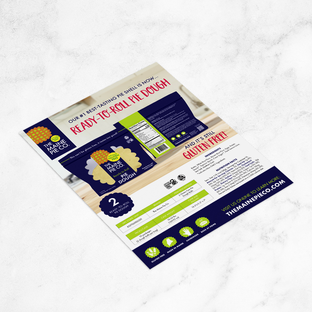
- Marketing Collateral
- Magazine Ads
- Product Sales Sheets
- Website Banners
THE IMPACT
The additional designs give Maine Pie Co.:
- Clear, consumer-friendly communication of gluten-free and dietary information
- Packaging that allows customers to visually connect with the product before purchase
- A consistent, recognizable look across marketing and packaging touchpoints
- A visual system that reinforces the brand’s homemade, trustworthy, and approachable identity
With these updates in place, Maine Pie Co. is positioned to introduce new products confidently while maintaining clarity, consistency, and authenticity across its growing product line.
