PROJECT OVERVIEW
Spells Coffee Shop is a local coffee shop and market in Salem, MA, specializing in high-quality, consistent coffee for grab-and-go customers. Beyond coffee, Spells supports the community by offering locally made food and artisan products, creating a hub for residents and visitors alike.
The brand needed a visual identity that could convey whimsy, artistry, and the magic of Salem, while also reflecting the reliability, quality, and simplicity customers expect from a daily coffee experience.
SCOPE OF PROJECTS
Spells Coffee Shop sought a brand identity that could:
- Balance a whimsical, artistic vibe with consistency and reliability in product and service
- Communicate the shop’s community-driven mission and connection to local artists
- Appeal to a wide audience, from commuters grabbing a quick cup to locals enjoying the Salem community experience
- Visually integrate modern, bright, 70s-inspired colors with a magical, inviting aesthetic
The design needed to feel simple, magical, and practical, mirroring both the fast-paced lifestyle of its customers and the warmth of the local community.

THE APPROACH
The design approach focused on creating a visual story that reflects Spells’ core values: consistent quality, simplicity, and community magic. Key strategies included:
- Selecting typography and visual elements that balance stability with whimsy
- Incorporating subtle movement in the design to appeal to on-the-go customers
Highlighting the connection to Salem’s community and artistic culture through shapes, colors, and symbols - Ensuring the identity was scalable across signage, print, and digital touchpoints
Every decision aimed to merge practicality with personality, making the brand feel approachable and reliable while also distinctive.
THE SOLUTION
The final logo and brand identity capture the dual nature of the brand: whimsical and magical, yet strong and dependable.
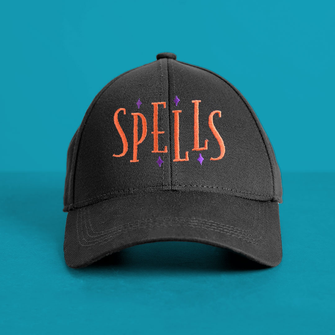
- Typography: A tall serif typeface was chosen to convey stability and reliability.
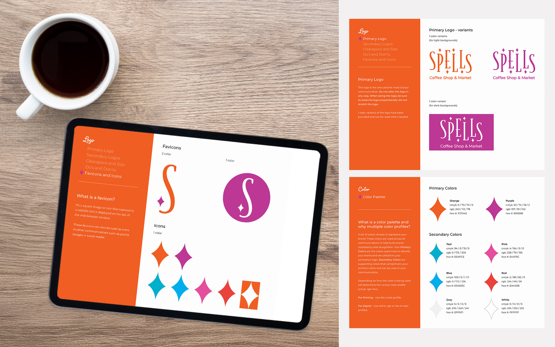
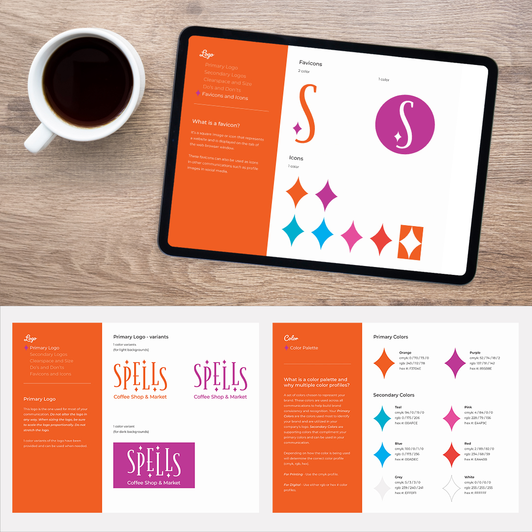
- Logo design: Letters were staggered evenly, with diamonds placed in select negative spaces to evoke a sense of movement and artistic whimsy. This subtle motion aligns with the fast-paced, on-the-go nature of Spells’ customers.
- Visual language: The combination of serif strength and delicate decorative details reflects both the quality coffee experience and the creative, magical community vibe of Salem.
This identity provides a cohesive, recognizable look for the shop while supporting the diverse ways customers interact with Spells, from daily coffee runs to browsing local artisan products.


SCOPE OF PROJECT
The project included:
- Logo Concept & Design
- Brand Style Guide
- Shop Signage
THE IMPACT
The new brand identity gives Spells Coffee Shop:
- A visual system that balances whimsy and stability, reflecting both creativity and consistent quality
- A logo that communicates movement and energy, appealing to on-the-go customers
- A design that embodies community and local artistry, reinforcing Spells’ connection to Salem
- A scalable visual language that can be applied across signage, print, and digital assets
With this foundation, Spells Coffee Shop is equipped to stand out visually, attract customers, and reinforce its mission of providing both quality coffee and a magical, community-focused experience.
