PROJECT OVERVIEW
The Sea Box is a subscription-based seafood delivery service that brings wild-caught, high-quality seafood directly to customers’ doors. Rooted in a multi-generational fishing family, the brand combines tradition, expertise, and a commitment to freshness with a modern, convenient approach to seafood purchasing.
The company needed a brand identity that clearly defined its niche, conveyed confidence, and positioned it as the go-to local “fish market” for people south of Boston seeking fresh, reliable seafood.
THE CHALLENGE
The Sea Box wanted a visual identity that could:
- Clearly communicate the seafood niche and the brand’s expertise in sourcing high-quality, wild-caught fish
- Convey trust and confidence in the brand while remaining approachable to new customers
- Highlight the family-rooted, traditional story behind the business
- Support a subscription model that simplifies the seafood purchasing process
The challenge was to balance heritage and expertise with a modern, clean, and approachable visual language that appeals to consumers looking for freshness, quality, and convenience.

THE APPROACH
The design strategy focused on clarity, authenticity, and simplicity:
- Emphasizing simplicity and ease-of-use, reflecting the subscription service and non-intimidating approach to seafood
- Highlighting quality and trustworthiness through typography and design elements inspired by the shipping and fishing industry
- Integrating family roots and tradition subtly through visual storytelling and reference to heritage
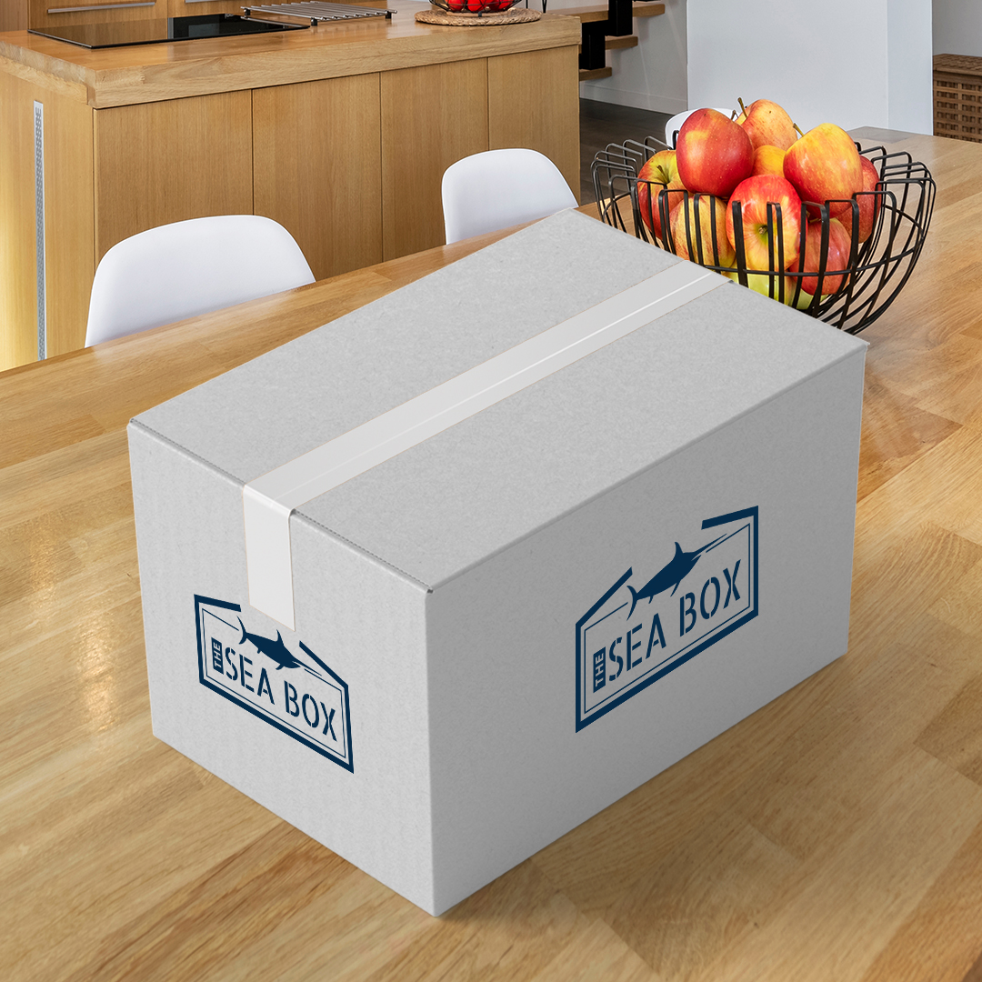
- Creating a visual identity that could be applied consistently across packaging, digital, and marketing touchpoints
Every decision aimed to communicate freshness, reliability, and expertise, while keeping the look modern and approachable.
THE SOLUTION
The final brand identity system reflects The Sea Box’s core values: simple, high-quality, and family-rooted.
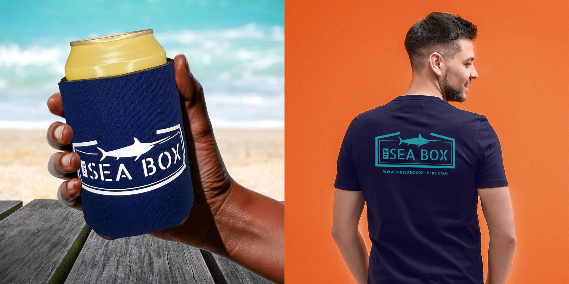
- Logo: An open box with a swordfish poised above, representing both the product and the act of delivering quality seafood. The icon directly conveys what the company does while highlighting confidence and craftsmanship.
- Typography: A stencil-style font reminiscent of shipping crate stamps reinforces the hardworking, expert nature of the brand, signaling authority and reliability to customers.
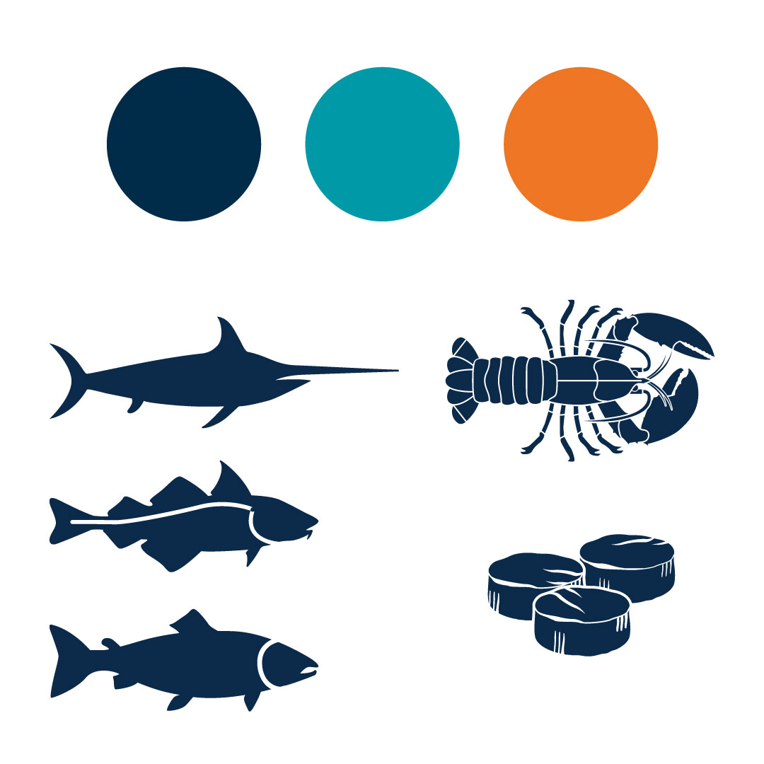
- Visual Language: Simple, clean shapes and layouts complement the bold logo, ensuring the identity is versatile for packaging, marketing materials, and digital channels.
The result is a cohesive visual system that communicates fresh seafood made easy, grounded in tradition and expertise.


SCOPE OF PROJECT
The project included:
- Logo Concept & Design
- Brand Identity System
THE IMPACT
The Sea Box’s new identity provides:
- Clear communication of seafood expertise and quality
- A simple, confident logo that immediately conveys the brand’s purpose
- Visual elements that reinforce tradition and family roots
- A versatile system for packaging, marketing, and digital use
With this brand identity in place, The Sea Box is positioned to stand out in the market, build trust with customers, and reinforce its mission of making fresh, wild-caught seafood accessible and approachable.
